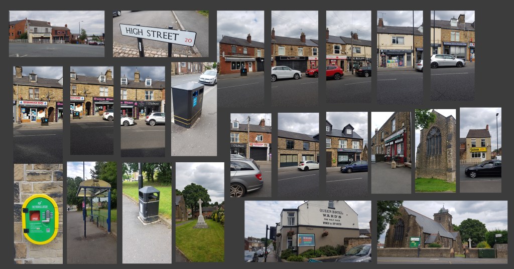
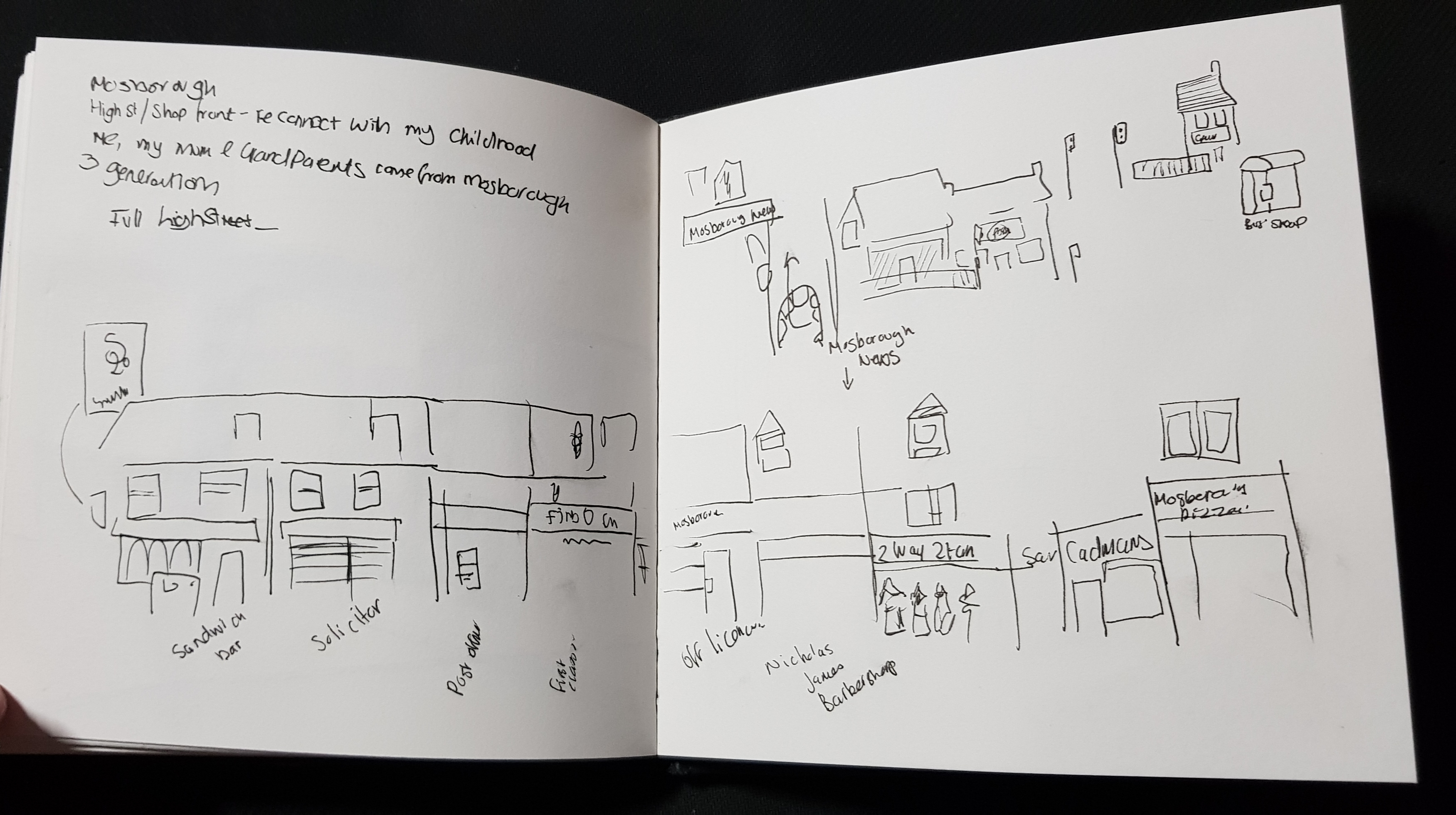
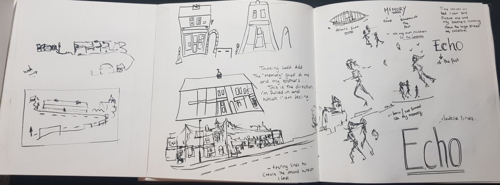
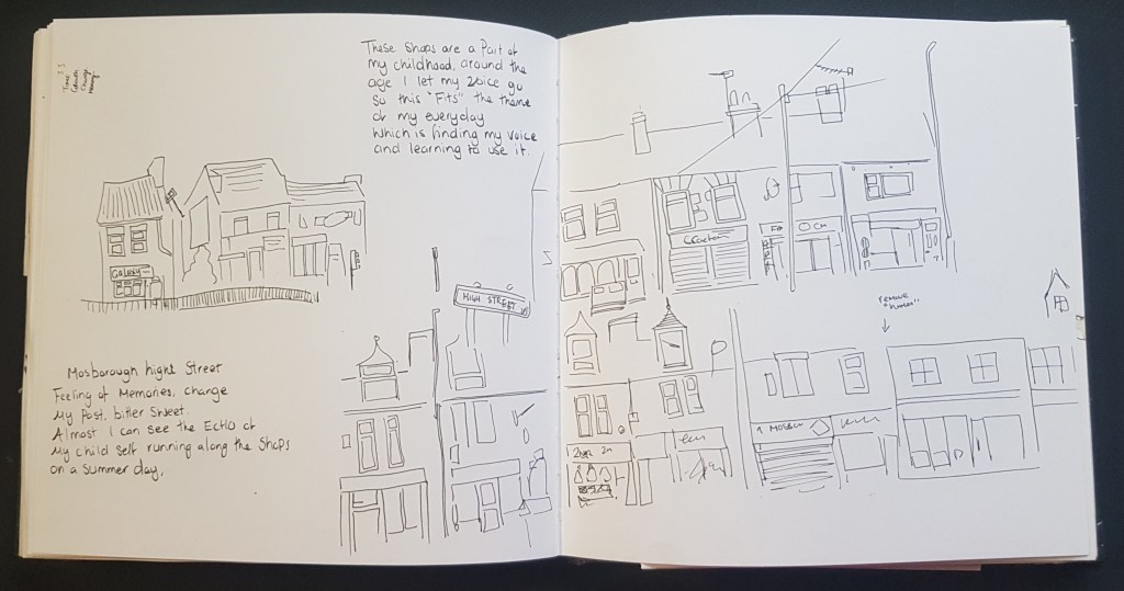
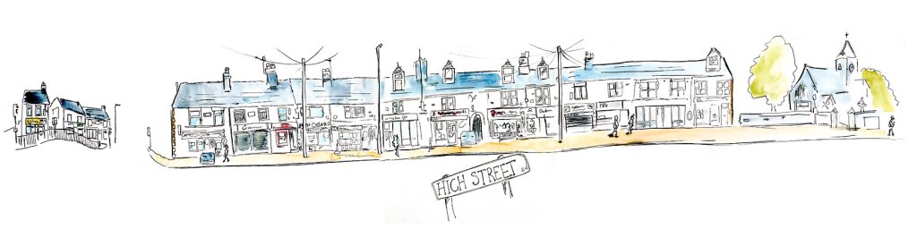
For this a “landmark” I had to stay local still. So, I returned to Mosborough high street, which are a row of shops. I’ve been wanted to do this for a while, as is more of a “landmark” in my own memory. It is the place I grew up, generations of my family lived in the village and on this very high street.
With this in mind I had a collection of words building. *memory. *change. *echo.
These are all emotional responses to my attachment to the high street. I had to trust my gut with exercise as I do face limited options, after all I can always do this project again beyond the slope of this exercise and include all these objectives in the assignment.
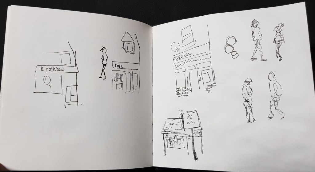
My intention in the photos is the small details I may miss/forget or if want to add elements I didn’t sketch.
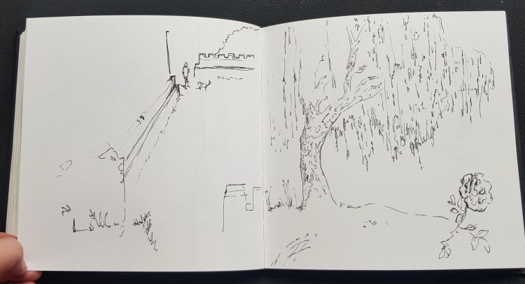
Personal sketchbook (above) – Ink sketches and notes Taking photos of each shop and making notes as I walked.
Upon my return to the house (I had set up my ink pens and watercolours) First started to tackle some visual elements how I can work this. Using the photo references and sketches I placed together a working draft for piece.
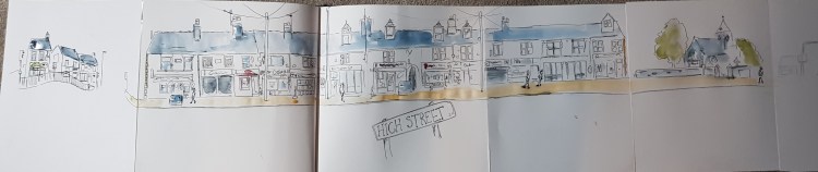
The snapshots along completed a row, I missed out some houses from the row and changed elements I felt would suit the vibe of the image better. One example of this is the church is much closer, and I moved some poles to avoid some lines over lapping.
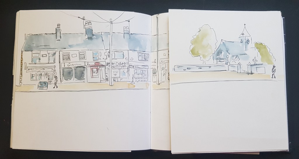
Course sketchbook – Ink and washCleaned up version (using photoshop)
I had a lot of fun doing this, maybe getting lost in my own vision. I had maybe lost my “word” narrative, but I was honestly feeling something I cannot find the words to express. What do the viewer see when looking at this ? Would they be able to get this unknown feeling?
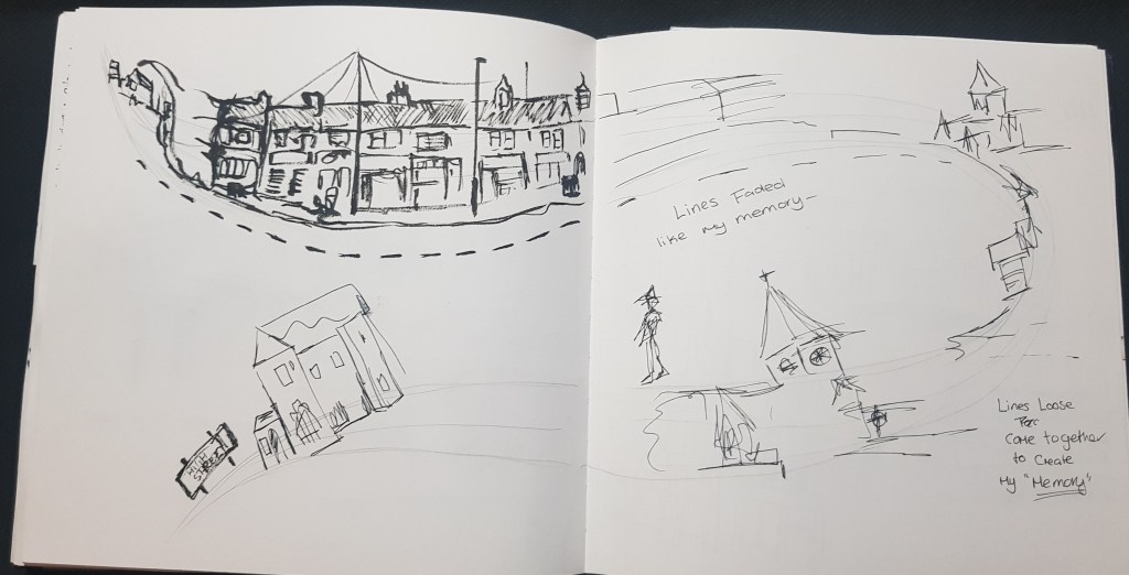
After the shop front, I wanted to create another more centred around my words, I wanted a faded piece like the memory of my childhood in this current shop front of 2020. My intention with this illustration is have a “fish eye view” to bring attention to the middle where the children run and have the street to fade out, to help give that impression by losing colour and detail. I maybe should have loosen the details and lines end of the street even more. But, overall while I love the first long street, this one is a better representation of my words and original intention.
I would love to do this again and use “words” to help me create a better narrative for places such such as a busy street how I could use the crowd to create the impression of busy and lots of movement and maybe a a haunted church, with loose dark values/wash.
I took a risk with my subject and word as it was emotive to me, and it’s if I can show that without explaining. I feel it, can others?
This being said, I shared to a local Facebook group my work, As wanted to say if saw me out and wondered what I was doing. I got such amazing feedback. Including someone wanting me to show case my work at their local history meetings and even a couple of people wanting updates and prints, Not something I expected at all! Also it made others “remember” and “miss” this place… So I ended up getting the emotional response from others after all.
I like what I created both times, I cannot lie I’m a little worried I didn’t fully carry out the objectives of this exercise as I lost myself in the emotional attachment to piece. Did it stop me being objective or did I do the right thing with allowing myself to feel and let my emotions take lead in my work?
I know I’m in danger of second guessing everything, this unit the limitations of what we face during COVID-19, means I’m not doing any of this unit, as I would have pictured. But at the same time these limitations may also can be a good things, I’m having to do this more creatively to make use the things and places around me. I have never been so inspired as I have of late, actually finding hard to find the right balance between wanting to sketch non-stop in my sketchbook to write my thoughts in this learning log.
Maybe the limitations of these days make me also value my creative time! I’m seeing things afresh as the world start to open its doors again to me!
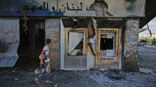
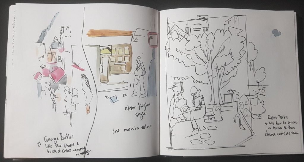
I picked both BBC photo (Left) and George Butler’s reportage illustration (below) to compare. Both in the Middle East, both have destroyed buildings and a single figure walking in front. (least most attention on one figure) both have had a sober mood, but I feel the emotions so much more from the illustrated version. I personally think while both very serious, you can feel the atmosphere more in the illustrated version.
George Butler Taftanaz town
What is each image expression, describing or communicating? Each is showing the world what is happening in other parts of the world, and how serious it is. Which Image is most memorable? The illustration without a doubt, as someone said we have become almost numb to these kinds of photos, yet illustrated version it is harder to not feel. Does one image seem more truthful and why? I know we see what the media want us to see, but honestly both feel “real”. Which image would you be more likely to notice it was in a magazine or newspaper and why? The illustrated piece, I had already noticed this, I would “forget” the photo but I cannot forget the illustration quite as easily.
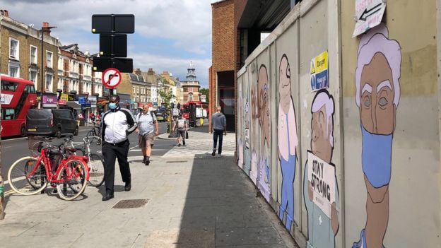
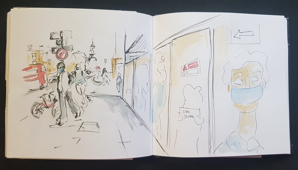
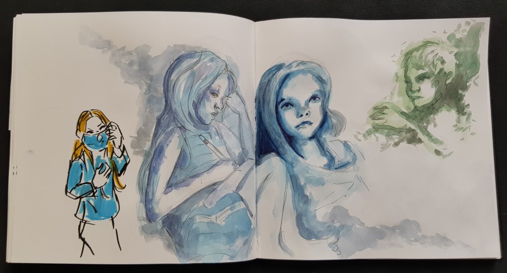
I wanted to try my own reportage images to compare to the photo. I went on BBC website and picked this article https://www.bbc.co.uk/news/uk-53523802 COVID-19 is big news at the moment and headlines are all about wearing facemask, while I planned to work from a photo it is also something I could relate to at the moment.
BBC Coronavirus: The day England’s shoppers put on their face coverings By Hazel Shearing & Alex Kleiderman
I did try to invest the feelings I’m feeling at the moment, knowing full well it will not be quite the same.
Created in my personal sketchbook, Ink and watercolour.
I didn’t think I would feel the difference so much between the photo and illustrated pieces. I think because photos can envoke strong emotions within me.
But I think it is right, we are numb to news photos, we quickly scan the photos and words… Yes, we do feel. An illustrated piece makes us feel, makes us stop, time and emotion have been invested more into the image by the illustrator.
“Reportage has to have flesh, bones and, above all, life in it. One is not illustrating, but pushing one’s nose info life.”
Ronald Searle, 1977
Quick notes on list of contemporary and historical artist known for their works as reportage illustrators. Pinterest board with works that appeals to me.
Laura Carlin www.Lauracarlin.com Calin is London based and worked for The Guardian, The New York Times, The New Yorker and the Boston Globe to name a few. As well as Illustration she works as a ceramicist. I find her work whimsical and yet a touch of a heavy mood of the seriousness of some of her pieces.
Paul Holgarth 1917-2001 English Illustrator Covers for Penquin edition of Graham Greenes books. I like how Holgrarth can see quite detailed at times when actually quite loose, also using blocks of colour such as a solid blue background and plain foreground, or building with a sharp contrast of red.
Olivier Kugler http://www.olivierkugler.com/ Kugler work first came to my attention in exercise, his work seems the most reportage in nature.
Emmanuel Guilbert French comic artist, First thing about Guilberts work I really love is his use of colour, the inky, watercolour washes, the pieces where he used to seriously contrasting colours are stunning.
Lucinda Rogers
Chloe Regan Works in Bath and London Likes to use idioms then explore a narrative. I love her playful matter of her work, I even was able to find this https://vimeo.com/chloeregan Which includes videos of her working on location in her sketchbook. I can really relate to the way Regan works.
George Butler http://www.georgebutler.org/ I’ve said before, I love the mood which Butler sets in his illustrations. His website is amazing. I like that he “reports” as well for papers such as the guardian and is so hands on. https://www.bbc.co.uk/news/av/entertainment-arts-36915751 – BBC news This report is very interesting as George Butler actually talks about what it is like to be a reportage illustrator. He talks about what I’ve started to realise myself, there is a big different between seeing something on the news, in a picture vs actually being there. Even when he revisit the places back home in his studio he can still picture himself there.
Louis Netter The ugly Muse – http://www.louisnetter.com/ (Reportage / Comic Illustration / Animation) I love the fact he covers many areas and interests. Reportage style – very sketchy – reminded a little of Quentin Blake Veronica Lawlor http://www.veronicalawlor.com/ Urban Sketcher – inspiration – more information found in Research Task 3.1
Agnes Dechourchelle French artist and illustrator, childhood in Africa. http://agnesdecourchelle.com/sketchbooks Before I read “about” Agnes, first thing I spotted were her bright colours and later finding this came from living in Africa around strong and vivid colours.
Beyond the list (other illustrators and artist of interest for the future) Wendy MacNaughton Peter Arkle
While doing my research I enjoyed this class by Faith Mistacoglu https://www.skillshare.com/classes/Watercolor-Sketch-Journaling-Illustrations-Typography-and-Composition/1034811451?via=custom-lists Who’s style seem very reportage, and I don’t think sketch journaling is to far step away from reportage as you are using the same skills, same information to document just the intended propose is different, such as journaling is more for yourself while reportage is reporting news to others. There is a interesting section called seeing vs looking.
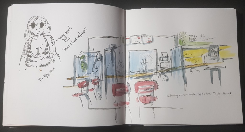
Above and below – Course sketchbook 1 Inspired by the styles of the artist and illustrators I wanted to break down the images and the best way I find I do that is to recreate (with my own touch) so that I can see brush stokes, composition and way they used colour. I moved on to recreate my sketch that I did for the last exercise in morrisons with a mix of the style elements that was inspiring me the most.
http://eyemagazine.com/feature/article/ardizzone-at-peace-and-in-conflict – Edward Ardizzone (1900-79) – First official war artist (Alongside Bawden / Eric Ravilious and Barnett Freeman) My thoughts Ardizzone created a written record published – We know his responses to the war and experiences, I think his cheer nature may have been a shield. Reading this the reality of reportage illustration isn’t just traveling to nice places all over the world. There is a harsh truth that you can only add the emotions fully needed to be on location, if you want to shock people with what is happening in the news, you need to be shocked yourself first.
http://www.eyemagazine.com/feature/article/olivier-kugler-bearing-witness – Oliver Kugler My Thoughts Kugler does not jump in with subject to sketch, he takes its all in first. Later on will create the illustration in his studio. The camera will pick up the details, this is true and one of the things I agree with as once we’ve been there, we can remember and relate. There won’t always be a chance to sit down an sketch every time.
http://eyemagazine.com/opinion/article/framing-the-evidence-of-war – Didier Lefèvre, Emmanuel Guibert and Frédéric Lemercier My thoughts A reportage and graphic novel hybrid – this sounds amazing and such an interesting take on something so serious as the Russia’s Afghan war, I can see this reaching people on another level. More so you find out that Lefèvregave so much to this project and died early.
My conclusion on this research task is one that I have been heading toward for the last few exercises. It does not matter if you take pictures, but what matters is that you have to be there in the moment, you have to “feel”. It makes sense that I as an illustrator has to be make that emotional connection to a place/event/moment.
Single figures will be easy for this exercise however for the crowds in the mist of COVID-19 I have to get clever. Firstly I did have my lightbulb moment about starting to cover important events, at the moment we have people wearing mask, quoqing to get in supermarkets and black lives matter protress. I’m however looking after two children full time and my husband is a key worker, this means I will be limited by free time to get out into “crowds” and all while being safe.
Another issue with being safe, is that I would have to be very careful due to my deafness as mask limit facial reactions and lipreading which takes away my means to read the crowd and people around me.
One thing I did find I could do a lot of research by reading books such as “The addictive Sketcher” by Adebanji Aladde, “Urban sketching a complete guide” by Thomas Thorspecken and “sketch you world” by James Hobb. Most useful parts was reading how each book explains different ways to handle yourself in public spaces sketching people, how to deal with onlookers. These books also have given me ideas for this exercise and futures ones where I would like to sketch.
Artwork by James Richards Urban Sketchers (Pinterest linked image)
I’ve also started watching a teacher on skillshare called James Richards who is an Author, urban sketcher, travel artist and designer. I also quite like his work and one of his classes are perfect for this exercise called “Urban Sketching Essentials: Drawing People and Crowds Made Simple”.
What I liked about his class is very early on he explained what the role of adding people and crowds to an urban sketch. How it isn’t about life drawings, it’s to give that organic sense, sense of movement, sense of life and it started me seeing urban sketching in a whole new light when comes to crowds.
Yes, there will be times when we want to get the essence of a person (which is when life drawing would be quite important) guess in some ways would depend on my own narriate while I’m sketching people and crowds.
I also liked that for a part of this, he shows his own sketchbook, talks about his work and I can see an end goal, in terms of urban sketching I’m a beginner and I will keep it up and interesting to see where my urban sketches will be in a years time/or by the time I finished my illustration degree. I’ve known since doing this unit, this is a lifestyle for me, it’s not just for the degree or even a career, I continue to grow and become urban sketcher. For this reason in my work I’m not trying to run before I can walk and really want to enjoy and build my own growth.
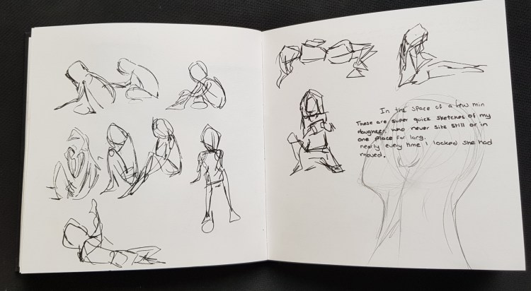
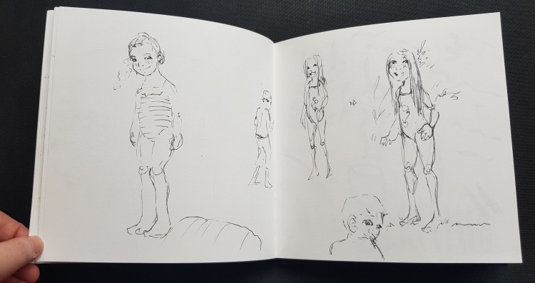
(above) personal sketch book 5 I started to sketch my family as they watched a movie together. I found it very hard, as they moved around a lot and I also went right to ink to create. I didn’t worry about the details at this point.
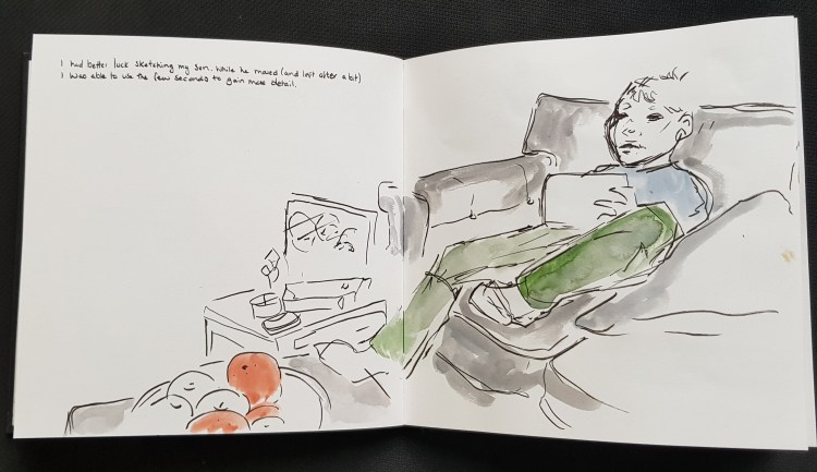
(above) Personal sketch book 5 Sketching my son – with a bit of watercolour.
(Above) – Personal sketchbook I tried to sketch my daughter, she would move every second so ended being more loose gestured sketches.
(Above) personal sketchbook 5 I was waiting for people to walk by so I could sketch them.
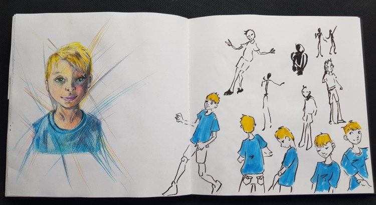
(Below) – Course sketchbook 1 First I drew my son running around, then added more character with a touch of colour. After that I included a more detailed sketch which I needed up colouring using coloured pencils and a watercolour base.
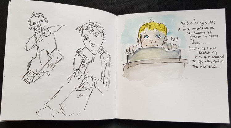
(above) personal sketch book 5 I was sketching my son again, when I caught a moment that I will treasure in my sketchbook. My son at nice years old seem so grown up lately, but he spotted me sketching him and it made this cute moment. The fact I caught it as a drawing and not a photo makes this so much more special.
(Above) course sketchbook 1 First I was sketching my daughter from a photo, at time due to lack of interaction with the world I wanted to get a feel for sketching people outside. At the time I was doing this, my daughter came and sat next to me and started drawing on the IPAD while watching T.V. It’s very rare she keep skill so I used this as a chance to create a more detailed drawing in pencil. I intended to leave in pencil however when added a light watercolour wash to stop the marks smudging, I ended up adding value. This is another special page to me.
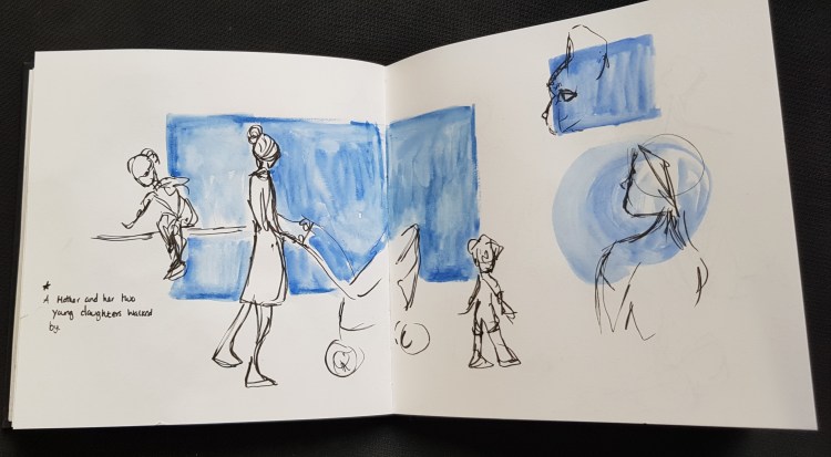
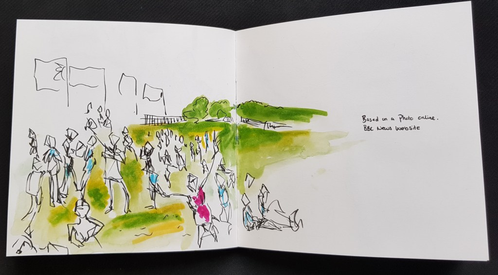
(above + Below) Course Sketchbook 1 I wanted to draw a crowd and at the time I was “stuck in the house” so I drew this based on a photo that was on the BBC website. Tried to keep loose and almost picture myself at this festival.
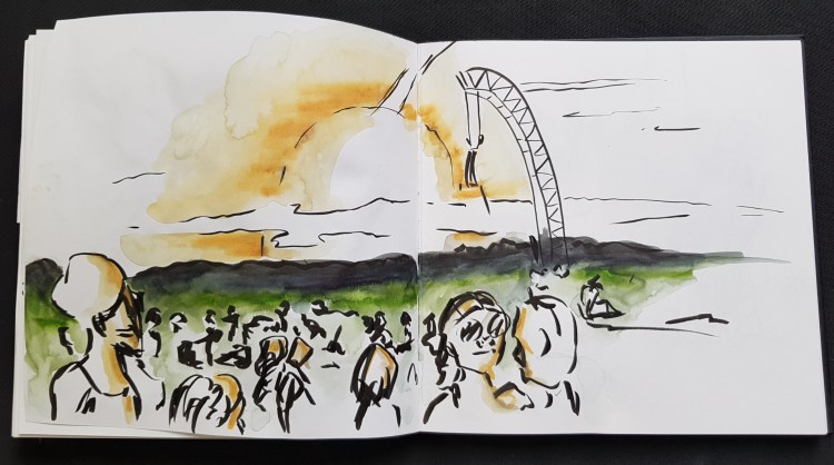
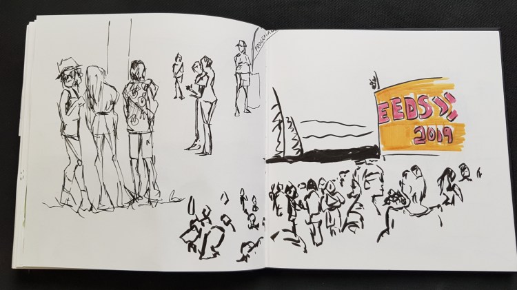
While creating the picture above this one, I remembered last year at LEEDS 2019, like always I took loads of pictures, so thought better than using the photos of others, I have my own photos. This worked better as while still a photo, I could remember the sight, smells and feeling as the warm sun set over the crowd.
(above & below) Course sketchbook 1 More sketched based on my own photos and memory.
I am quite glad I did this, there is a clear difference in the way I felt when sketching a picture I’ve not taken, with no memory attachments vs a place I can remember the feeling of being there, closing my eyes and back in that moment I took the picture, feeling the heat, the glow of the setting sun over us and the music in the air, the mood, the vibe. Now I fully understand you have to be in the “moment” not just taking a quick snap / or seeing a photo online, but to “feel” that as it influences me as I draw.
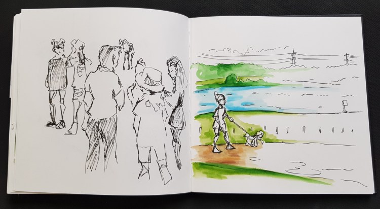
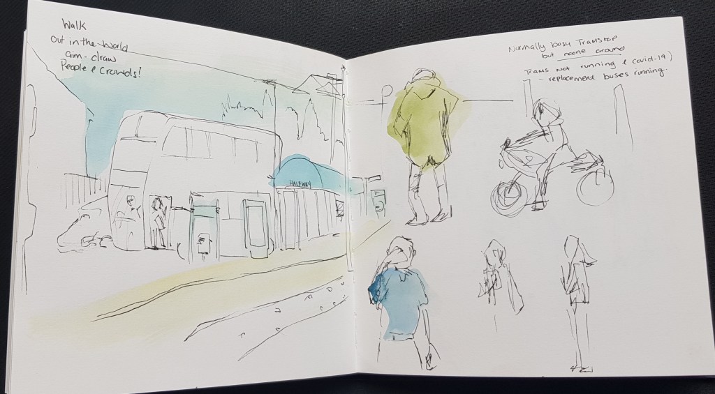
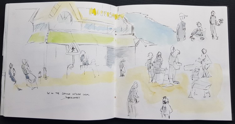
I finally had the chance for a walk locally. I tried to aim were I could find crowds, sadly my first idea which was the tram stop didn’t work. Not only due to COVID-19 the trams were not running and replacement buses were running.
I stayed for a bit as still a chance to sketch the stop and the few passer-by’s.
Lucky I was only a short walk away from a supermarket and at the moment crowds have to wait to get in. So made my way there, and stopped and sketched (left) and some walkers as I passed them.
I let the store know what I was doing and went outside and sat and sketched people, apart from one or two people giving me odd looks, it went well. Was able to do some smaller studies, tackle a bigger crowd and add the store.
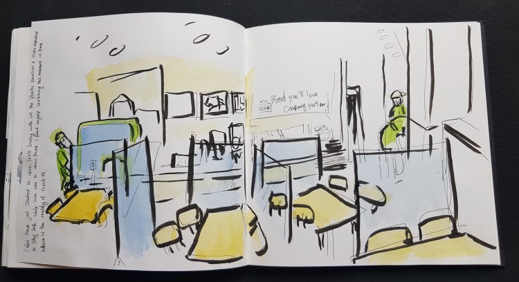
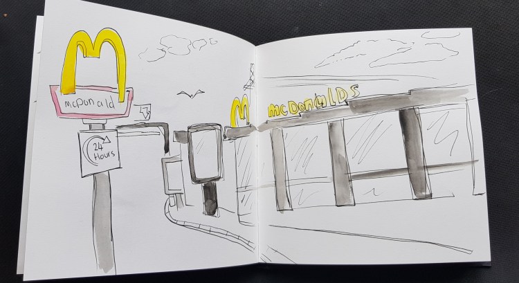
(below) – Course sketchbook 1 While the aim was for me to sketch people and crowds, cafes just started to open up. I was most curious about the plastic barriers between the table that created “safe” bubbles. It seem very cold and alien to the friendly café that I’ve been used to.
Then the world starts to open up again….
Then lockdown started to ease, while still very much at home with my children. We started to see and visit places again. Everything seems so new and exciting again and I want to draw/sketch everything, so while my main objective were people a crowds I also covered some of the things I missed in exercise one and two.
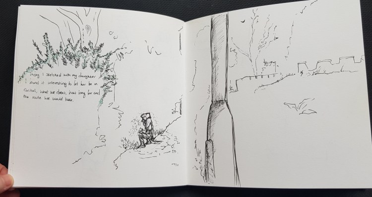
First was a walk with my daughter, she wanted to go on a sketchbook walk with me. So I followed her, sketched the things she wanted to draw in the same amount of time. (means a couple unfinished pieces) not only was it a fresh way to view things but to also bond with my daughter.
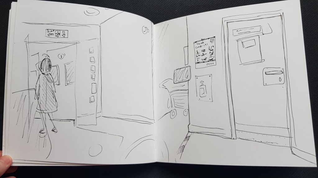
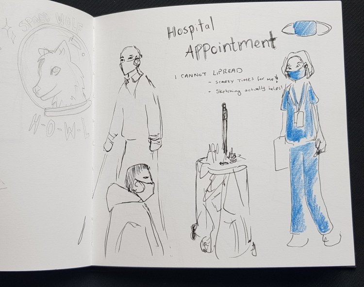
NHS – Sheffield teaching hospitals I had an appointment at the hospital, I was very nerious has everyone were wearing masks and as I lipreader I’m completely out of my elements. But I was able to calm my nerves by sketching, I may add some colour later, something like hospital green or blue to add to the feeling of being in hospital.
I missed a good chance to sketch outside the hospital as there was a fruit and veg stand out outside the main doors and due to everything I had a taxi booked that came right away.
So this has been added to places I want to sketch someday.
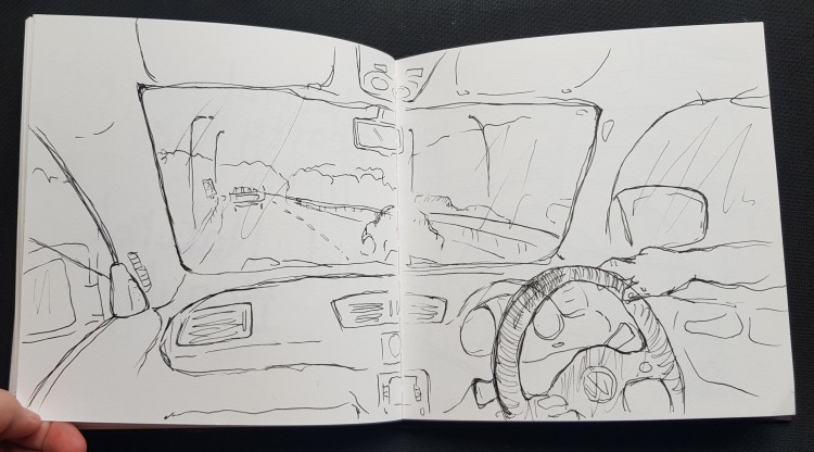
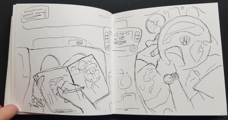
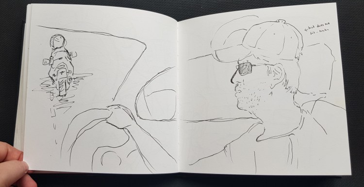
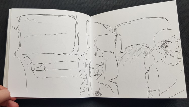
Car drive to York – (personal sketchbook 5) Social distancing meet up with my in-laws. Found it fun to sketch in the car on the way up and a challenge in a moving car.
I have a list of growing places I want to sketch / urban and crowds *outside the hospital – with fruit and veg stand *Sheffield city – Winter gardens / Weston park / Peace Gardens / Kelham Island / Meadowhall/ Botanical Gardens / Velocity Tower / Cathedral / station / Tram *On transport train/tram/bus *York *Scarborough *Whitby *Robin hoods bay * Lady Bower Reservoir *Bamford Edge * Rothervally * Chatsworth House * Bolsover Castle *Renishaw Hall *Butterfly House *A zoo
Other work.
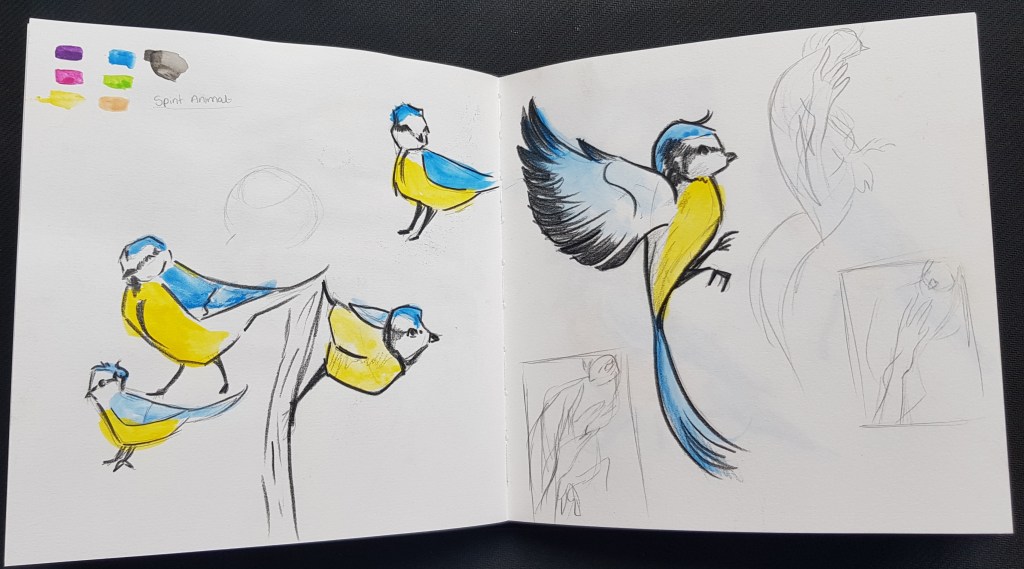
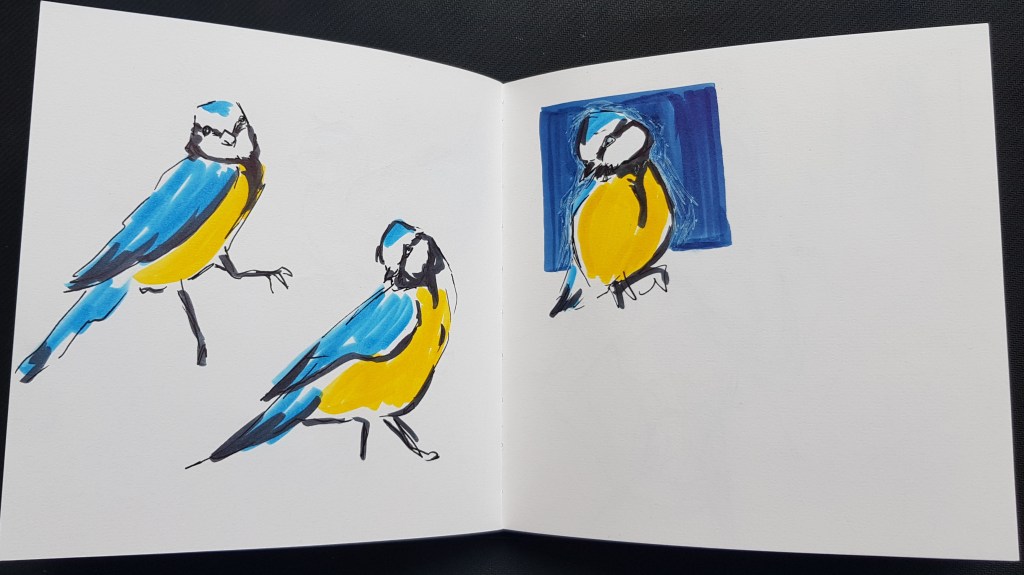
Bird study – Blue tit As the above exercise has been “broken” up, I found I was still keen for “studies” as well as trees/leaves I seem to have a lot of birds in my work.
I’ve had two very important lessons over the course of this exercise. One is the importance of experience, to feel the moment that I want to sketch.
The other was things I’ve been watching and reading, I saw sketchbooks as a “study” a place to make mistakes have fun but not really “finished” work. I have the skill set to lift work from my sketchbook and to “fix” digitally so that it is in fact a finished piece. Don’t get me wrong, I have used sketchbook work like this before. For some reason I’ve not been thinking in this mindset.
I enjoy sketching the world, I really do. Both from photos and being physically there in the moment. I also like the fact I’m not using my pencil as much and using pen for more organic lines. I like the fact that is isn’t perfect! I have still so much to learn and that excites me!
I want to draw more, create more, I am so inspired at the moment. I do however need to find a good new healthy balance between my sketchbook work, research and writing up my learning logs.
I love photography and consider it one of my main hobbies, if the dream wasn’t to be an illustrator I would have pursued a career in photography.
So I take a lot (and I mean) A LOT of pictures, I also watch and read a lot relating to photography, about a year and half ago I started experimenting with viewpoints and seeing things differently. I think nothing of laying on the floor to get a good shot.
So I was really excited for this exercise even with COVID-19 lock down rules and on-going health issues which means I cannot lay on the floor taking photos at the moment! Plus I did take photos as well for first part due to the rules, I was keen to “see” things differently. I walked the same path, this time gaining more freedom from the children, however I did have a limited time to get all I needed, It was a clear sky day, and no high risers so also limited look up shots.
I headed for the church, I ended up taking more from different angles. It wasn’t inspiring me as much as before, although (above) I tried to see it differently and create using geomatics shapes.
(above) created with oil pastels I tried different viewpoints of the everyday “landmarks” I passed.
A couple of my look up shots (that wasn’t just blue sky) Left – Watercolour Right (and middle bird) – Gouache I liked this page as after a few “messy” pages this felt clean (due to me using masking type for the edges) I wasn’t aiming perfect, I wanted to treat still like wasn’t working from photo and like I was needing to get detail down quickly.
Ended up having a mini study based on birds and limited line and simple shapes.
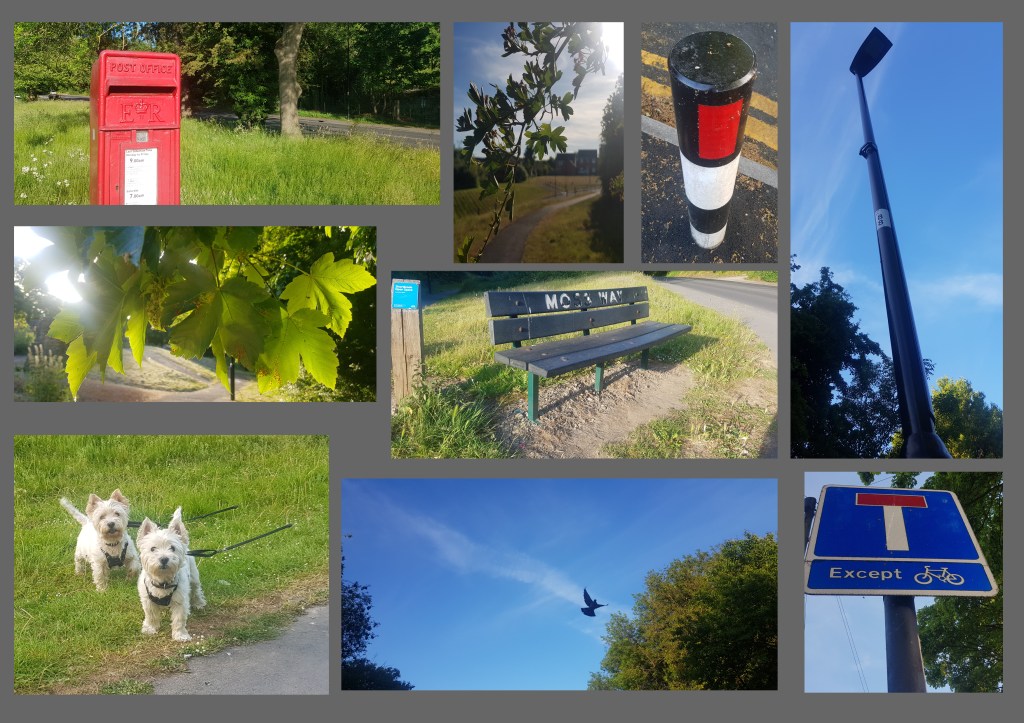
I took photos of the post box from different angles, as I felt I could add a bit of colour pop to my studies (as mainly green/blue/yellow) On the right is a photo where I had the reflection of the high street in a store window, my intention was to feature the high street, however when I came to do it I wanted bold colours to balance the page spread better and ended up having fun with ink, I ended up over working the reflection so it is more of a blur. Never the less I kind of like the result I ended up with. I also got the angle completely wrong, I tried with all these to draw loose and not to worry to much about perspective, although I acknowledge I think need to find a balance while drawing on in the field
These are similar views, but taken from different angles or peeking though the leaves. I also wanted to colour these in fun colours and ended up creating the church in different colours.
How would it look if I used some left over gouache and folded the pages ? This was very random, I painted the church one last time and closed my sketchbook the results… Random page really.
(below) sample of the photos I took. I took quite a few – as said above I just love taking photos. Even took some texture surface photos to make into digital brushes and use as pattern overlay to create texture in my digital work.
*What is the relationship between photos and drawing I made in my sketchbook? The photos aid my drawings but do not create my drawings. *Do you see the photographs as a form of reference to possibly help you inform your earlier sketches or do you consider them to be an alternative and separate form of visual art? I do not see this as black and white, for example I could take a photo as reference as won’t be able to sketch there and then, I see as something could refer back to if wanted to work on an image again, also I think the lines of “visual art” are blurred. I am very much a believer in making things work for you, why limited yourself when can have the best of both worlds. *Do they provide visual reference? Yes, this time I saw new things, I was looking at new angles, I was looking for visual interest though the lens this time, that started me thinking about making the photos visually appealing therefore changed my point of view or “box” if you like which I was fitting my sketches in. *Did the process of taking the photos make you want to return to any of your sketches and develop them in some way? Yes, as above you can see I wanted to recreate these images, take more time on them and add more visual elements.
This part wasn’t quite as intended / due to nature I had to do the first exercise. With this in mind I will be ensuring that I carry on with both objectives as well as future exercises. It is easier to explore and relax with colours when working with photos over that of sketching outside. I would think that is more my lack of experience urban sketching more than anything.
Out of the artist/illustrators on the list, I found myself quite drawn to the works of Lucinda rogers, George Butler and I think I prefer the loose quick style, loose lines and limited colour, I feel a lot of emotion from their pieces.
That’s not to say I didn’t value, Paul Hogarth and David gentleman, I actually once in a while just like to sit down and take my time drawing. In fact Hogarth line work gave me some ideas to test out with shading.
Then we have the works Olivier Kugler, out of all the artist and illustrator he has the most stand out personally and artwork, he feels to me the most unique, I enjoyed seeing the world though his brilliant mind. But the way he see things is different from me, his work is almost alien but never the less exciting.
Created in procreate
Created in procreate
During the main part of this exercise I did have to take pictures, rely on memory more, I tried not to copy from the pictures. It was hard to do as just started to ease up on the COVID-19 a little, but limited freedom.
It was unintentional my pages ended up a bit cramped again, I wanted a story board flow/feel to my pages and once stuck photo I found my pages filled up quicker than intended. It took a couple of pages to sort (had created quick sketches to sort the layout)
This is likely most natural for me, although did limit the colours I used. Line and wash it more “me”.
I also like this page, it could be a method and technique to take forward in the future. This was a spur of the moment page, I also wanted to create the walk using one line so one continus image. I had planned to leave as just the lines, but it lacked any focal points so I tried to used limited two colours just to help the image flow and form better.
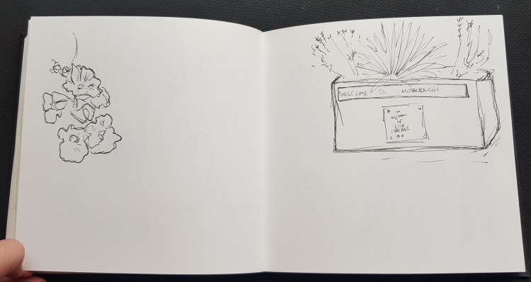
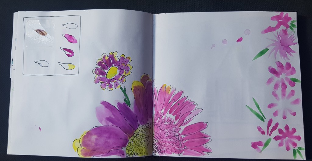
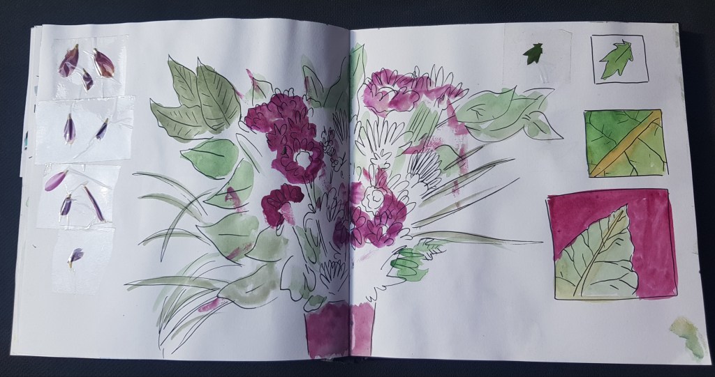
Side project, that links back into part two. I did a mini study based on my wedding anniversary flowers, taking the leaves close (but a bit more illustrated over fine art/detailed) Figured the trees have been covered over the course of this exercise so I can tie together my sketchbook with this ongoing theme.
I quite like drawing with a nib pen and ink, however I will face an issue with not being as portable as some of the other mediums. I found some recommended ink brush pens by Thomas Thorspecken in “unban sketching a complete guide” 2014 Search Press Ltd, which are Pentel black ink brush pens. However he states not waterproof so that is important to me, I found some pens like it and I’ve ordered to test and possibly add to my travel kit along side with some new Windsor and newton watercolour markers.
While not yet fully managed to be able to enjoy this part to it’s fullest, I tried to act as if was sketching on the street. Remember the feeling of being in the places and not “looking” at photos intensely. I’m finding a style that is natural to me, which I need to fine tune, experiment and indeed start to add people/crowds, so this leads me perfectly into the next exercise.
I will also carry this exercise on as things start to ease with COVID-19
I love art supplies, so it is natural I like “testing” things. I’m just at that stage where I’m starting to learn what I like. I do still try to be open minded when comes to my “tool kit”
I started building my artist bag a while ago when started keeping my personal sketchbook, at first I was very “kitted” out but quickly realised I needed to be more portable.
With that in mind I have three “tool kit” stages.
This is my everyday set, I do not even need a bag. Tend to stick the pencil to the sketchbook with the rubber putty, so this is really my grab and go.
Set C is what I like to take out with me, I will add and take things away from this kit so it is a work in progress.
Set C, if I have the space / weight to put in my bag.
I used to be a face painter and have painted murals so I’m kind of used to being in public. I do however worry about being in the zone and not realising what is happening around me so I think I would look for “safe” spots. I am very nervous about this, but it is something I would like to tackle over this unit. I do face a couple of issues at the moment due to COVID-19 / Rules – making me more wary about being in public / I have to think about not only myself but my children. Another issue is a medical problem that I have to wait until hospitals are back to normal before can be fixed / plus recovery, I have hernia that is going to require an operation. I do not want to put this section on hold longer than I have so I will be working around it as safe and careful as I can.
Veronica Lawlor – Reportage Illustration of times Square / new York (Canson Paper)
Veronica Lawlor – Reportage of busy Chinstown district in Bangkok Drawn on location
YouTube – From Brooklyn Independent Television’s Caught In The Act, episode 39. Original air date: 7/22/2011. http://www.bricartsmedia.org/bit
The main thing I wish to take away from the study of Vernica lawlors work is her limited uses of colour, how it actually makes the whole page feel filled with colour, when the reality is that a simple line or block of colour gives the impression of this!
I am a little all or nothing when comes to colour, so this would be an interesting challenge for me. I really enjoyed looking over her work and I hope I’ve gain more insight and confidence to move forward to the next stage in my own sketchbook journey.
I had started sketchbook part two being very opened minded, ready and excited to explore. While I knew was going to have to explore within my sketchbook, I had found this part to also be an intense discovery that led me towards an emotional destination as well… This emotional journey has been very powerful and I just hope this shows in my pages, as it really has been my “everyday” for the pass month.
I honestly want to take so much forward from this part, I don’t think there was a single part I didn’t “like” or didn’t have a bit of enlightening moment, I can see me in cafes using food/drinks to add that stain so can add a more organic feel of the place in that moment! I actually do not feel like I’ve “completed” this section as so much more I can do as really inspired.
There wasn’t just one single artist I didn’t want to take something from to learn, even if wasn’t my “style” sometimes they had a such great emotional insight and connection to their work I just had to learn from who they are as a artist/person. If was to pick artist who style is likely to influence my work the most in the future, it would be Sophie Peanut as she has the most illustrated style.
What did I find hard was not knowing which direction to go and sometimes unintentionally having a more polish finished then what I was wanting, when wanted to be loose and more in the moment. That’s not to say I didn’t have the moments at all and I found that I surprised myself with the results (such as rapid draw & limited lines together).
I want to take everything forward with me (not just for the next section) but as an artist and illustrator.
Part Three People and Place. This next part really worries me, not because of the exercises but the times we live in (Covid-19) I’m starting my third unit for an overlap to give myself more freedom to do this next part. Realistically I know I won’t be able to carry out this part with the freedom I originally wanted, the world will not be the same for a while, at first I was really upset by this as it is an area of growth to get me drawing freely in public. But over time I’ve came to realises even if I do not have the chance now… Nothing to stop me growing beyond the slope of this unit, I am not limited by today, yesterday for tomorrow will come!
This assignment asks me to build upon the work I’ve produced so far and in short create a “happy accident” illustration.
First I needed to build a character based upon my work in Facial Pareidolia, I had already envisioned these a little while I was creating the faces, so I wanted couldn’t wait to bring them to life. I recreated the characters in gouache, trying to figure out body parts in quick sketches.
(Above) Course sketchbook 1 (Painting in gouache) These two “characters” are the ones that appealed to me the most out of my characters first, I started to worry it wasn’t being very creative by doing “robot” type characters even though it is in the nature of the items (Controller and Cam) also the robot had a feeling of WALL:E although this is not intentional, just the shapes worked best. So I felt needed to give other characters a chance to shine.
(Above) Course Sketchbook 1 Gouache + Black Posca Pen This character is based a tin opener I couldn’t help relate to the rusty tin I found within “drawing with objects”. It felt very wild west and I could also use the “other” characters such as sharper as the loyal horse and dog as the garlic crusher.
I took the tin opener, redid the design of the tin from a block of flat to a “saloon” this was done all digitally with procreate. I did feel this missed the objectives and goal of the assignment a bit as I was controlling the outcome, so isn’t quite the nature of an accident.
(Above – course sketchbooks) I created a character design page for the “Cam Robot” character whom is called BOLA, the Cam is design for a game for young children, so I made BOLA’s personality a young, fun and emotional robot, I created some poses to have more freedom with my selection.
(Above) – Selection of pages / parts from my course sketch book 1 At first I wanted to maybe draw / paint the the characters sitting on the bench or branch as I have these in my sketchbook.I was thinking however I needed an unintentional (accident) with this, so far I’ve had maybe to much control over the results and style. So I went though my sketchbook and picked backgrounds I felt would be suitable as visual interest all while being “random”.
Taking the scans/photoshop I added the character to the background.
I admit the resulted turned out more “polished” than I ever meant, while I placed together digitally it actually looks more Digital than I would have thought. Also I wonder if I came to the conclusion of this assignment too quickly, while I didn’t rush it felt I skipped steps, maybe as a lot came from work I did prior this, I know not completely settled in the new format yet as I’m quite used to key step in illustration 1 and this is quite different. This feeling also because I enjoy working in sketchbooks and creating characters that I’m not feeling like it is “work”.
I did get a chance as well to work on my gouachepainting skill set.