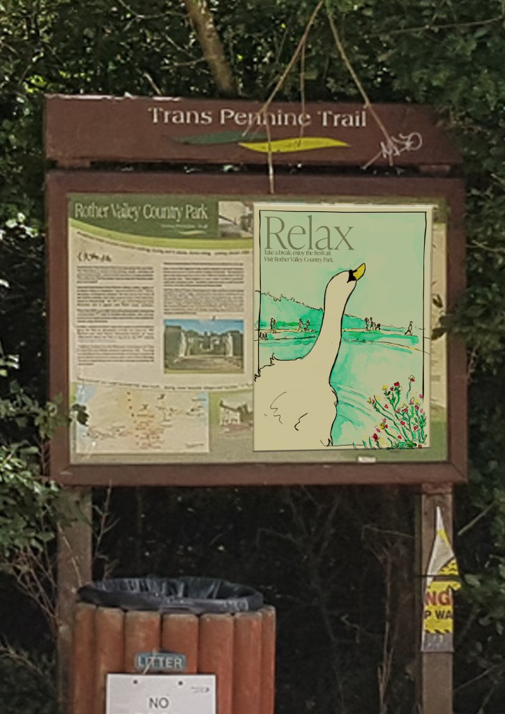
Assignment two (Below)
Typo fixed on main poster.
This was followed by a new mock up (the plan is to also add the two new designs next to the mock up (smaller than the main poster)
this mock up was created using a photo I actually took on location before the second lock down.
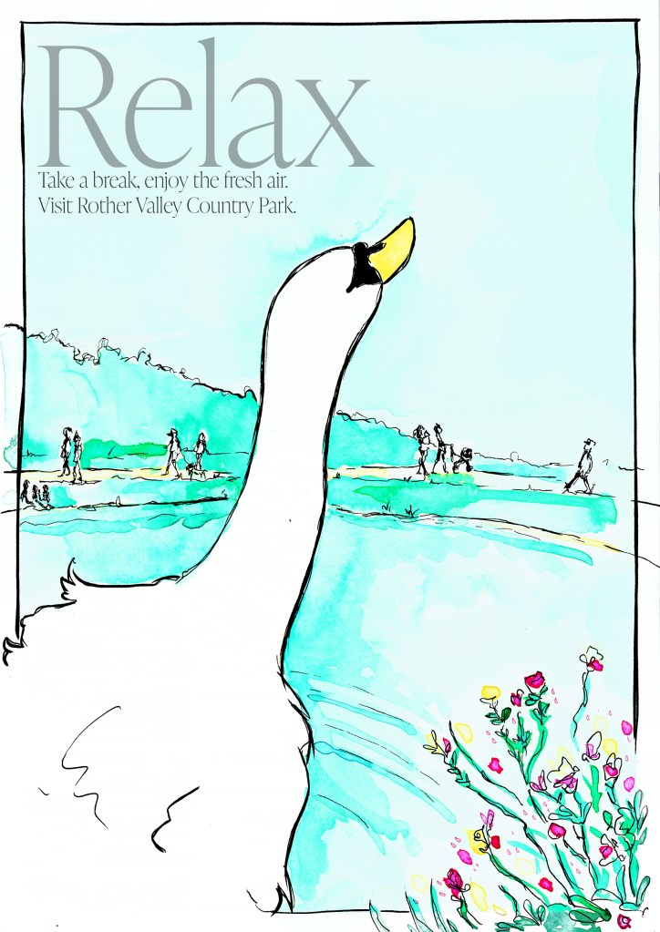
Assignment one (Below)
I made the background less saturated on the advise of the tutor to make the character “pop” more. The background being very saturated in colours in the first place (and character being quite neutral tones apart from the grey) this was something I didn’t do enough the first time.
Also added a bit of noise to the background to make the textures create more contrast.
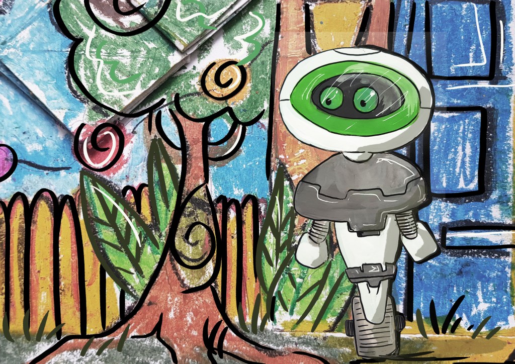
New “hearing aid” illustrations
These one I was having a play with, adding more line weight / textures and details