I had many ideas, so many ways I could have taken this. (below)
Ideas included
* Expending the conker scene
* My husband is a dog story line
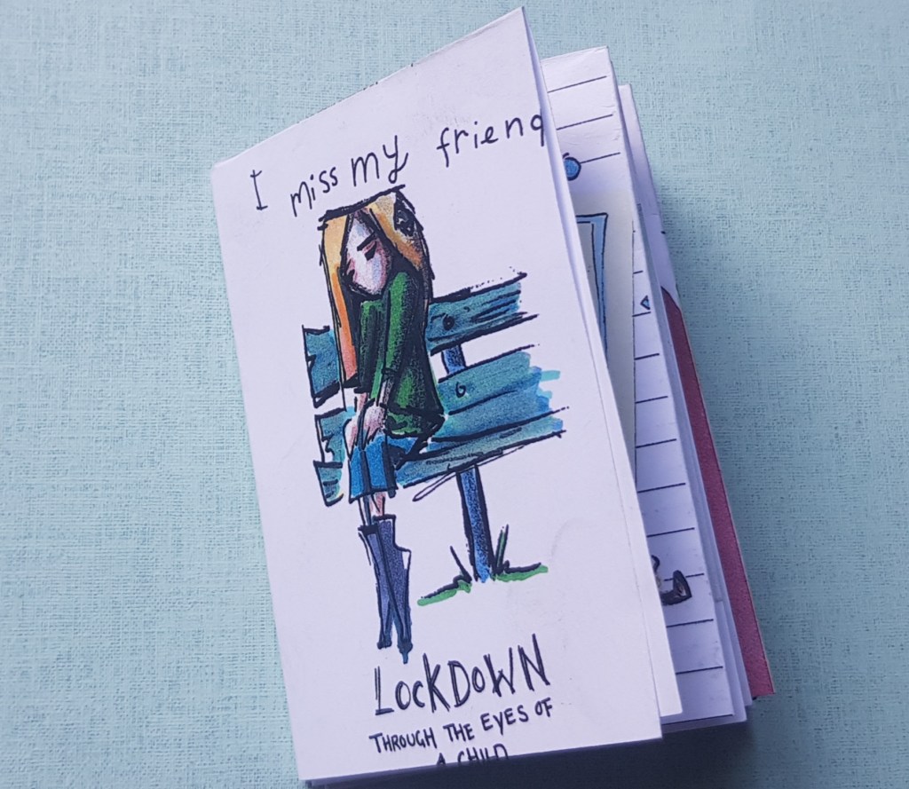
* I miss my friend – Dialog with one of the figures.
* School run
* Swan lake/Swan angel
* The peacock
* The boy learning to fly with the help of wind.
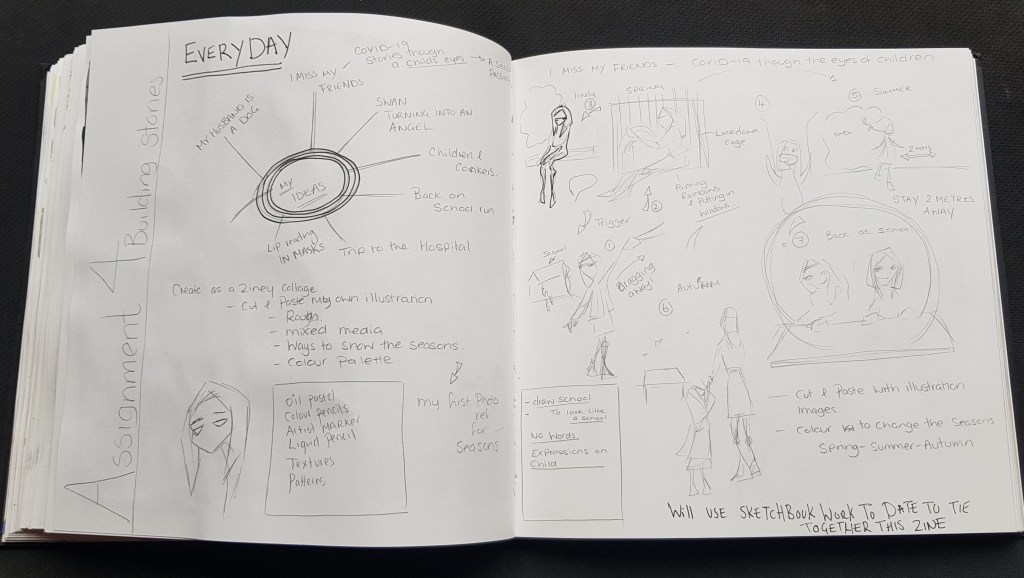
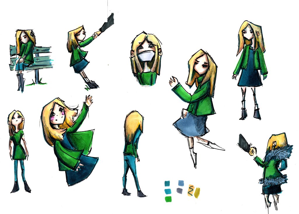
What has been important of late is for me to feed this voice within me, so I wanted something personal, something my everyday, so I picked a sketch I did for exercise 4.3 Conversations with pictures – interpretation of a young girl which I wrote the inner dialog as “I miss my friends”.
I felt an emotionally connection to this image and wanted to “tell” her story.
(Below is the sketchbook page this idea formed from)
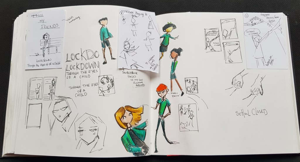
The Character, I wanted the character to make the viewer feel what I did sketching her alone on the bench looking sad.
I didn’t want to give to much away, so the character key features is just eyes, I tried to get the expression in just the eyes alone (bar the panels when she was “happy”)
Shapes kept simple, but clearly a young school age girl.
(below) sketchbook growth of this character.
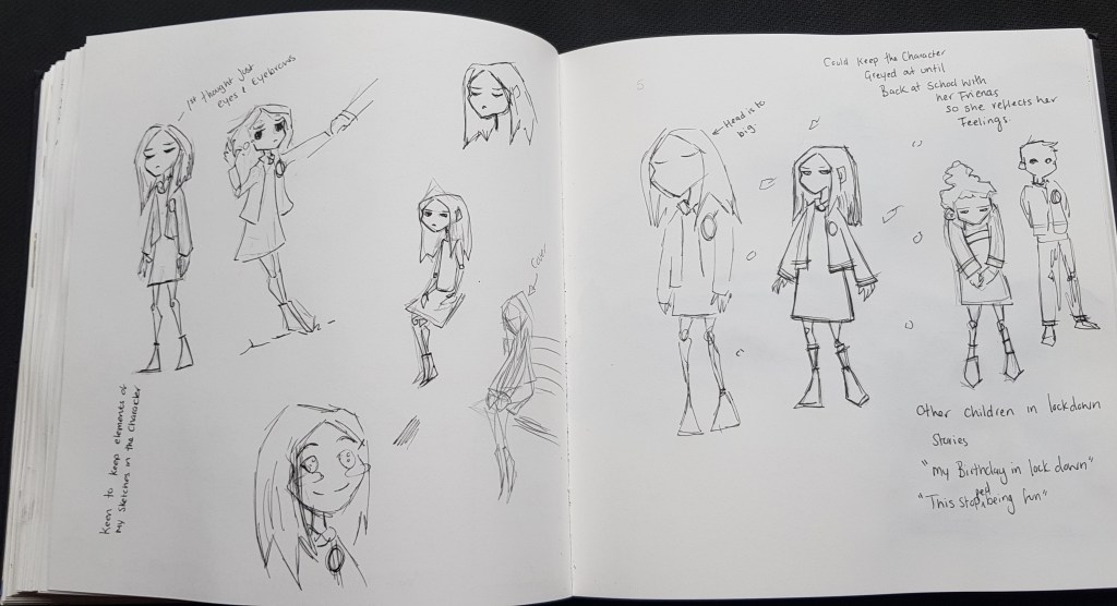
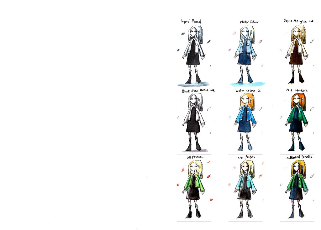
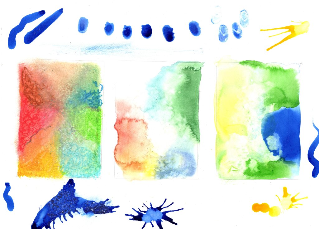
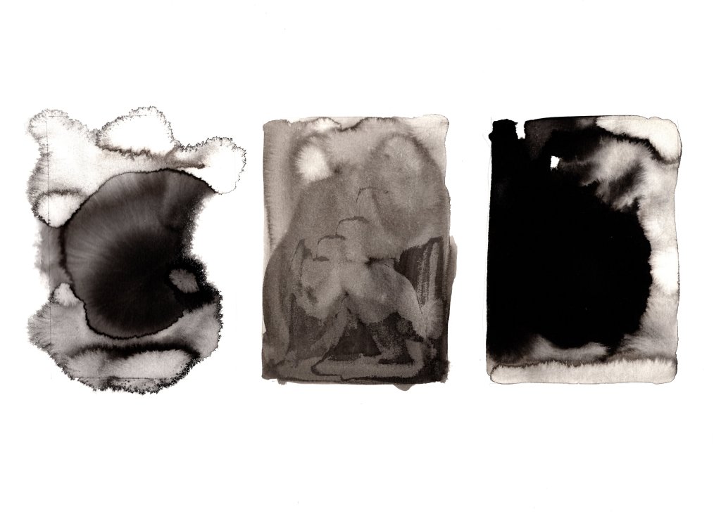
(One I had the “character” I wanted the right colours, originally my thought was more greyscale to show the mood but this was one of the ideas I dropped as felt wouldn’t come across right in the small space and work as well with watercolour/wash background. I would need to have a very bold/colourful background to pull this idea off.

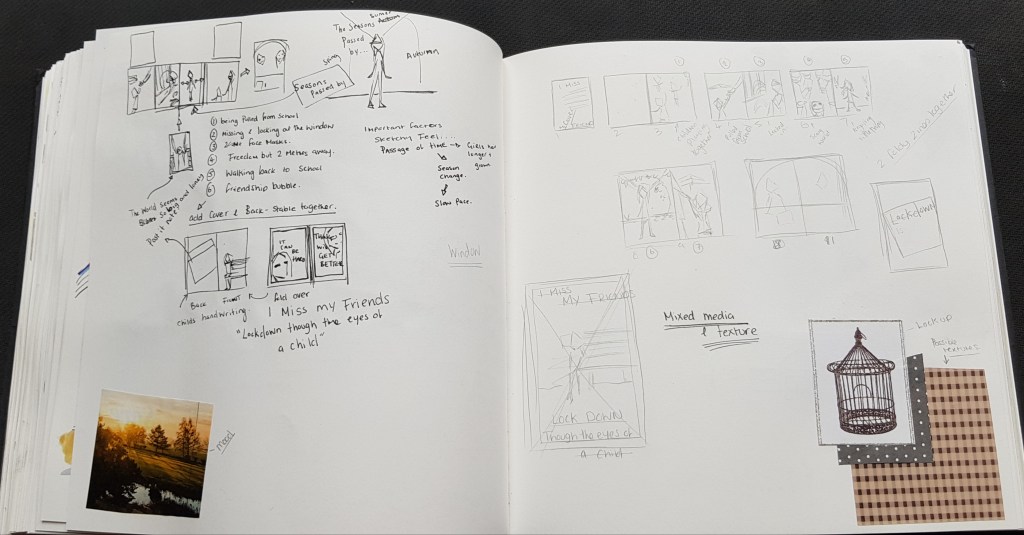
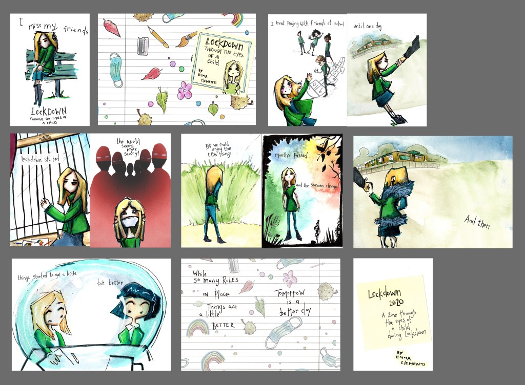
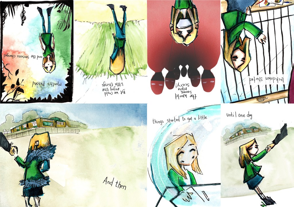
I was keen to have 8 panels, each representing 8 steps of story structures, with a bit of overlap in some panels.
While the original idea was to have a single folded zine with a cover added, I felt cramped for room in this format, there is the passage of time every presence in the panels so I didn’t want the stories to flow too quickly.
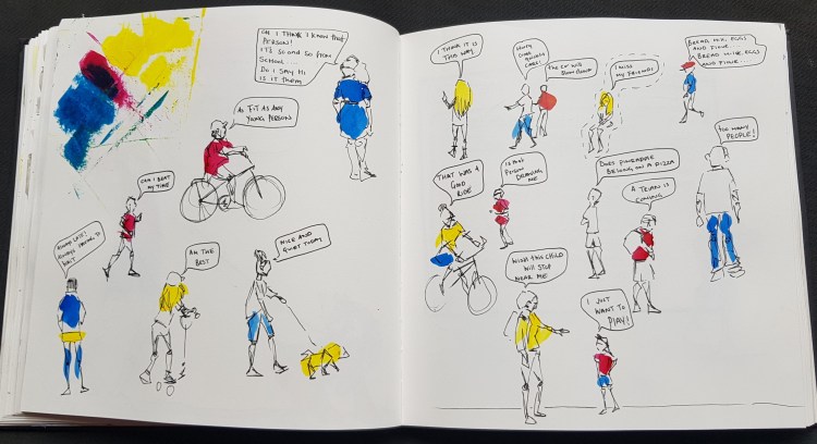
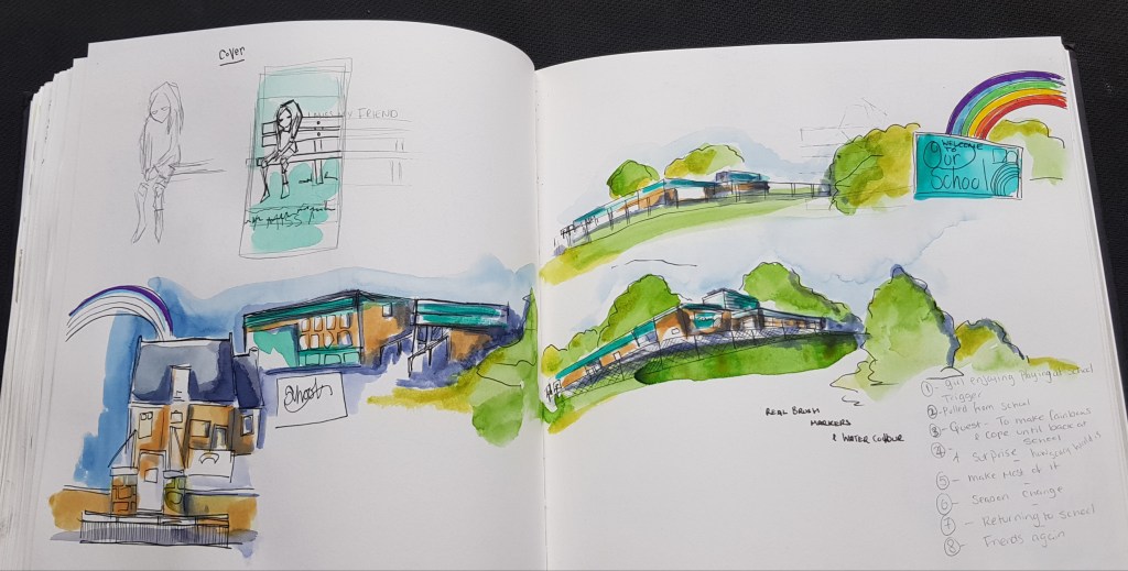
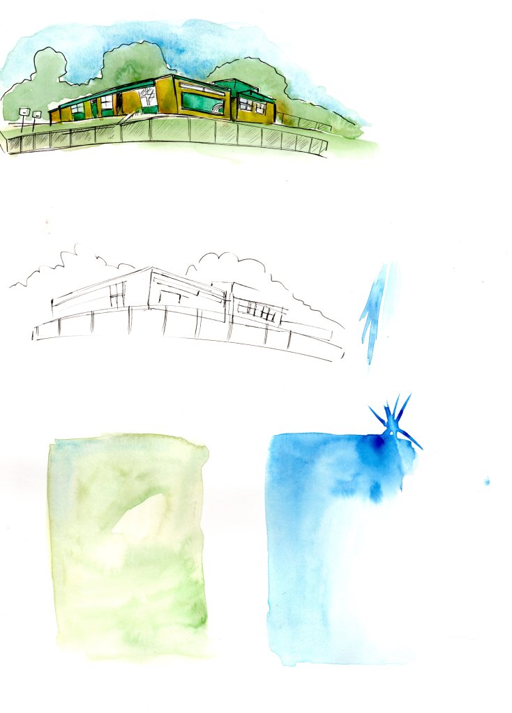
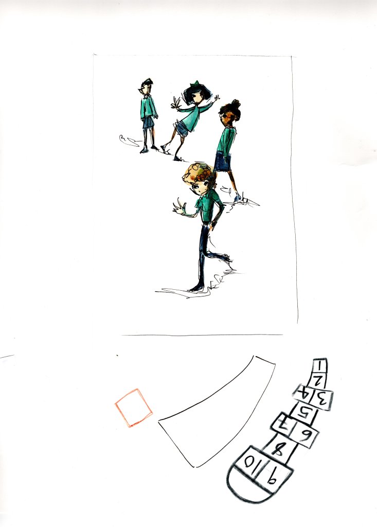
I needed more for my illustrations, I relooked though my images, I went by schools to sketch the buildings.
I worked things out across the panels when I had the sequence coming together.
One thing I was aware of at this stage, is that this would be a A4 folded down Zine, so I had to think about space for the zine to breathe and flow.
This did mean I had to drop some elements I wanted to add so that the finished Zine wouldn’t be to heavy or cluttered.
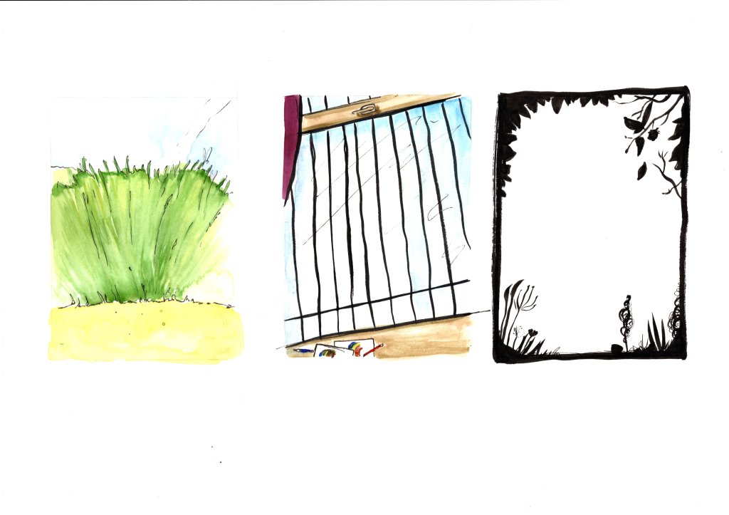
(Above) Here I started pulling ideas from sketches I did though out the course and from photos I did took as well for the same things.
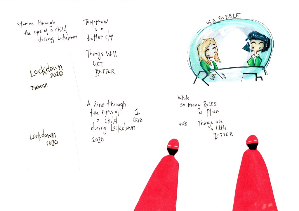
( Above ) this point I’ve made up my mind that the “cover” was going to be the images that had drawn me in, I wanted it to feel like a cover.
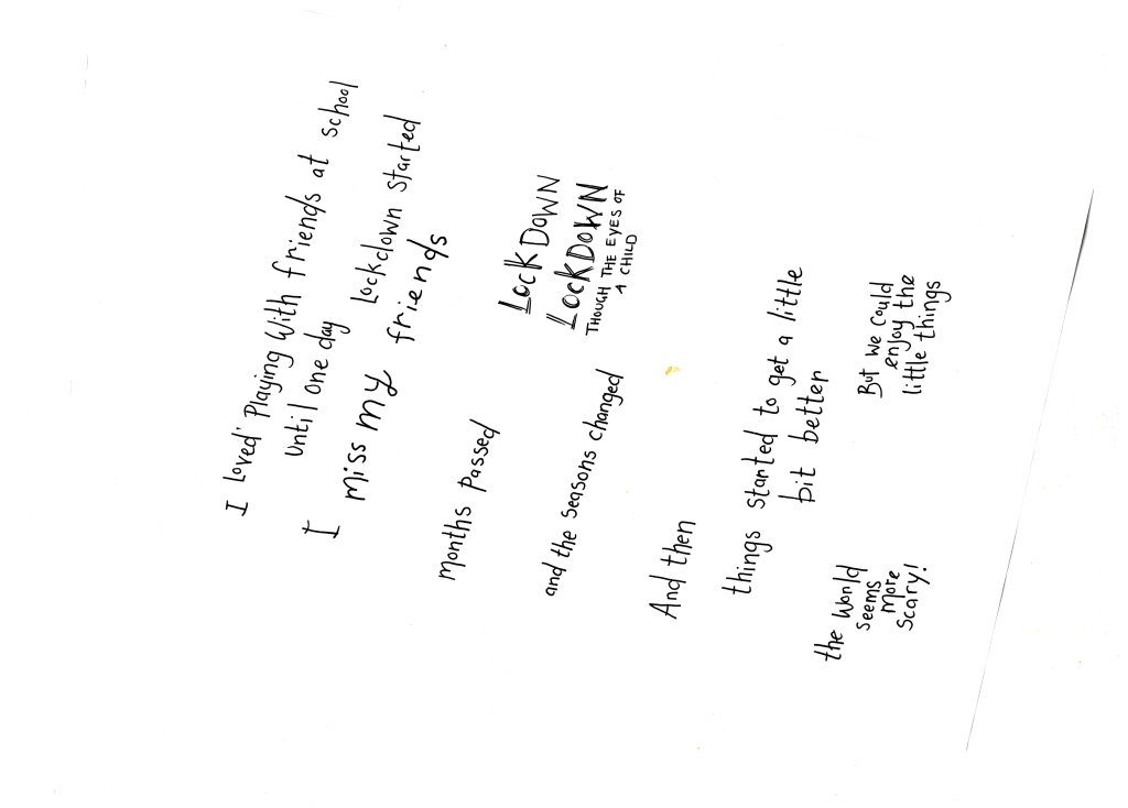
Pg1 – Next part was the opening part which I wanted to show the girl in her element, playing with her friends.
Pg2 – was the child being pulled away from school.
Pg3 – Child looking sad, lonely during lockdown, but making most by creating rainbow pictures.
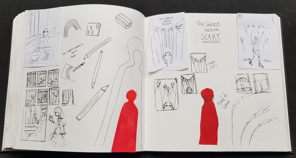
Pg4 – World is different and more scary
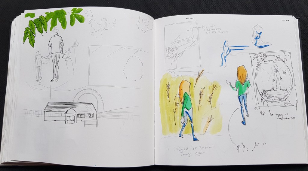
Pg5 – Still little things could enjoy
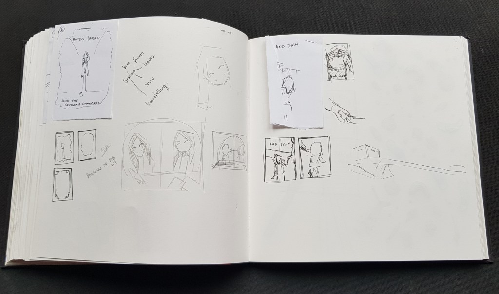
Pg6 – Months pass
Pg7 – going back to school
Pg 8 – Back with friends
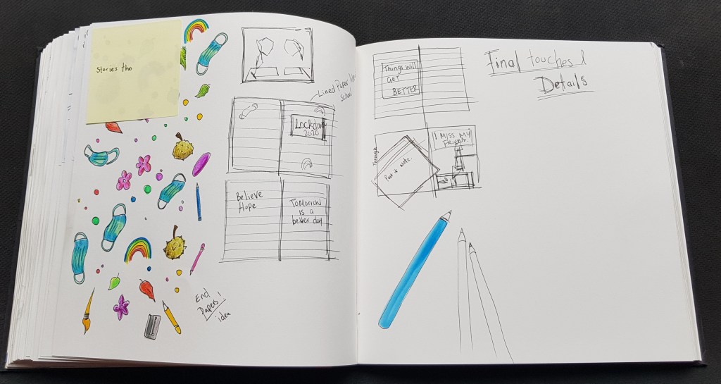
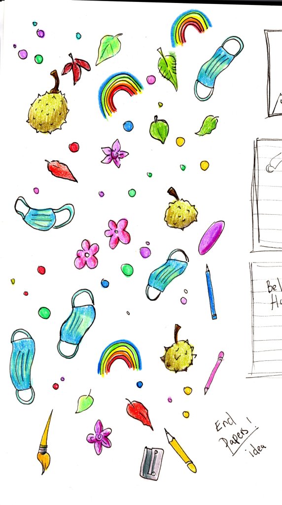
End paper pattern and back cover
I also originally planned to be text list, but due to the “slow” nature of timing, I wanted to add more feeling via wording.
So I came up with the idea of very short, simple
Also like the child is specking to the reader, than telling the “story” of this zine.
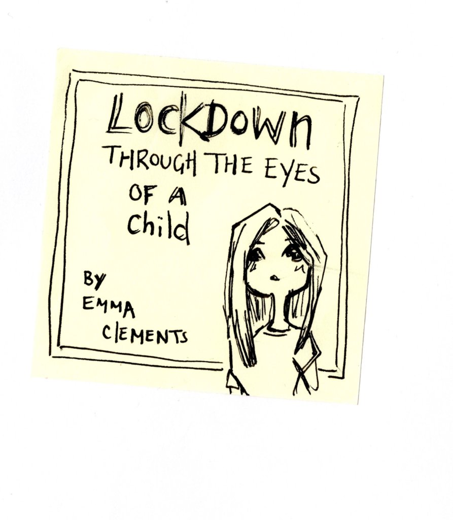
I got my daughter to write the cover title, which I copied and used as felt this added a realistic childlike touch and made more personal.
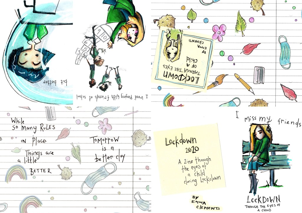
I wanted the zine to feel a bit like a cut and paste zine, yet bringing the childlike element to the table. I thought about everything I’ve learnt today, more so from my visual diaries studies and set about adding these elements to the zine.
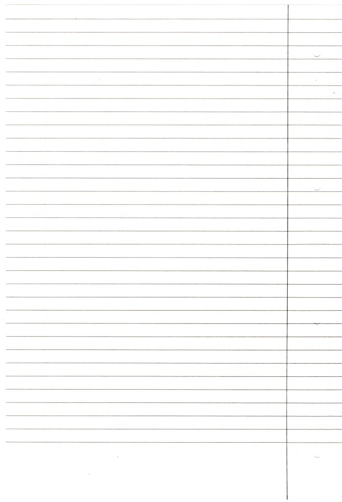
This took shape in using lined paper (scanned and cut/pasted into the design) creating a patterned childlike “covid-19” doodle and scanning in a post it note. I used this to create “end papers” to the zine. On the back I tried to add more positive notes.
Below is gallery view of all the individual scanned elements before “cutting and pasting” digitally together.
Using Photoshop and the scanned above images I started to paste together my pages.
On the spot I made some design/layout changes as some didn’t seem to work as well as planned/hoped.
The Mock up.
Due adding two foldy zines together to create this, I had to clearly work out how to fit the pages together.
Below – Print layout
The first mock up
Couple of Printing errors and folding
Such as I used paper that was a little to thick at 160gsm to fold down this small (would have been better around 120gsm mark) and I didn’t size correctly to print.
But overall gives the idea of how will look.
This is something real, something everyday in terms of narrative. So this isn’t as “fictional” as I could have been with a story. It is a risk on my behalf as so many other things I could have done.
I wanted something with feeling, motivational and with a meaning.
This is what life is life during Covid-19, it is a story, while came from my illustrations, an inner dialog moment could very well be told today, something people can relate to.
Also it is a bit risky it isn’t a “narrative” that shows “movement” in a story, the time between panels are to vast to be anything like that.
This is an element in my personal stories I hope I have showcased in the other exercises where I shown more real time narrative flow, this format suited this better and this is the pacing for this story, from the moment the idea was the one I was drawn to the most.
I think most attachment comes from narrative with emotional / empowering meaning to me, I feel this from fact I have so much I’ve held inside me for so long now I want to use all of that to both creative stories with meaning for others and to help myself heal.
I’ve enjoyed this as it is “me”, this is what I have to say and what I want to use my voice for.
I think this is the direction which my final is heading….
