COVID-19 – July 2020
I wasn’t sure what I was doing for this assignment, or even where to visit and sketch.
Due to may have a stay in hospital soon and my husband working a lot over August I knew had to think of something sooner rather then later so I do not delay my studies to the point of a complete stand still.
Originally I thought Sheffield centre would be a great place, however so much is still locked down and intense rules meant I wasn’t really comfortable to do this yet. So I wanted to make my assignment relevant to the current situation.
The day I was brain storming ideas/my thoughts it was over cast, dull and a day feeling depressed about lock down/ limited freedom and just “had enough”.
So thinking back to sketching people in mask, I thought maybe doing an editorial illustrated piece with a narrative zombies horde of people missing the “human” touch due to social distancing and new up and coming mask wearing rules.
Near by to mw is a Country park called Rother Valley, which has this lake you can walk around. Thinking this could play upon my own sketchbook journey with the “path”.
But will remain open minded and kept this as an “idea” to maybe explore.
So I set of to Rother Valley to sketch.
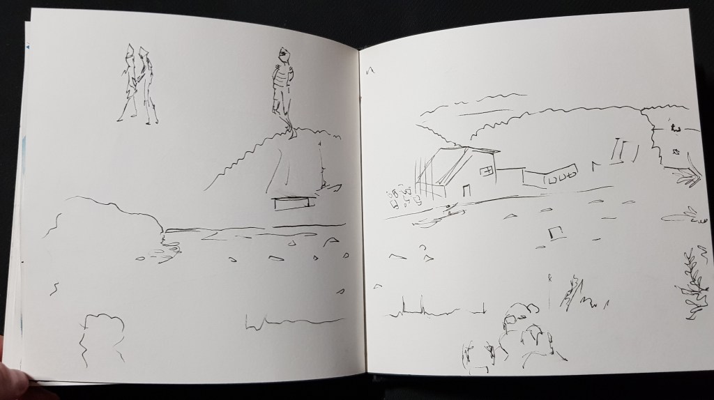
First Sketches – Part one
Personal (smaller Sketchbook)
Most sketched on my trip around Rotherv ally / couple finished via photos and by adding a little colour.
Weather – nice, warm, sunny with a gentle breeze.
But also kept spelling correctly!
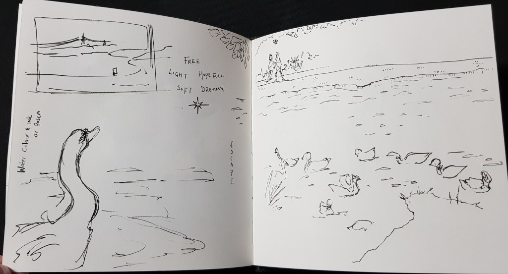
I think at this point it was very clear my narrative had changed, my mood was lighter and the weather was beautiful.
I felt very free, like I could breathe and just relax and enjoy my time at Rother Valley.
I had no idea the route I was going with this now, but I knew It has completely changed due to my experiences and mood.
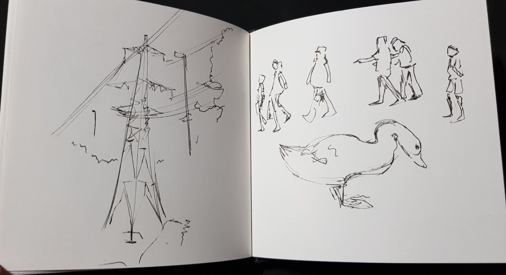
Second Sketches – Course sketchbook – Part two
At home, with use of photos I took and sketchbook work.
Trying to create my narrative and using SCAMPER methods.
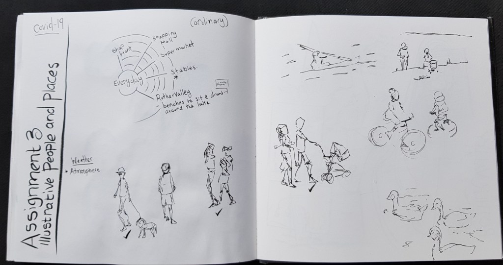
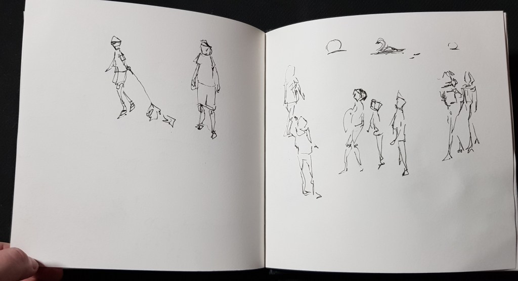
Bit of a brain storming and quick people sketches.
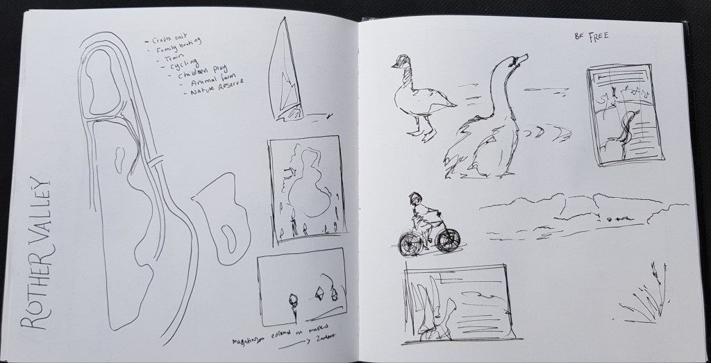
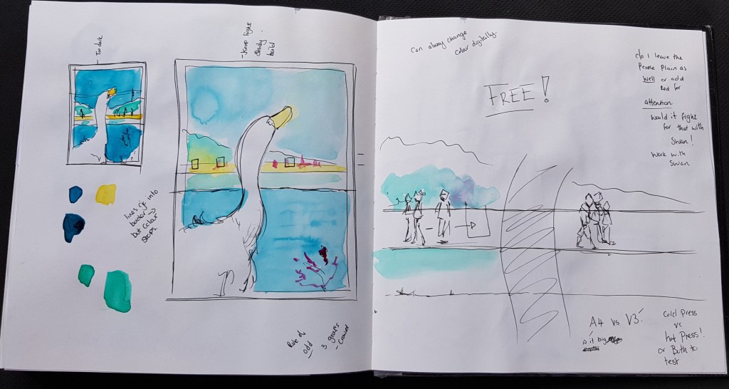
I started to draw the Map of Rother Valley thinking a more diagrammatic take to this poster.
At this point started thumbnailing ideas.
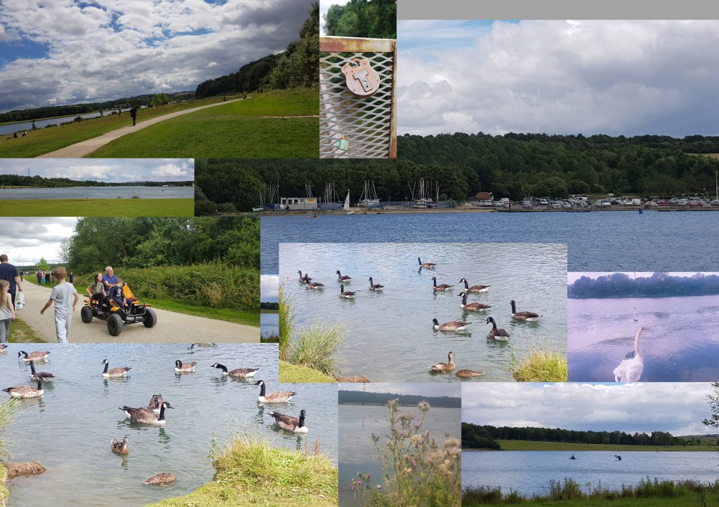
(Above) Collection of the photos I took which included some locks as chain of thought could be a play on lock down.
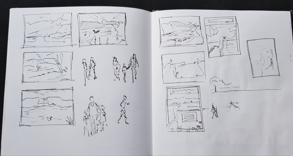
Thumbnails of different compositions and ideas.
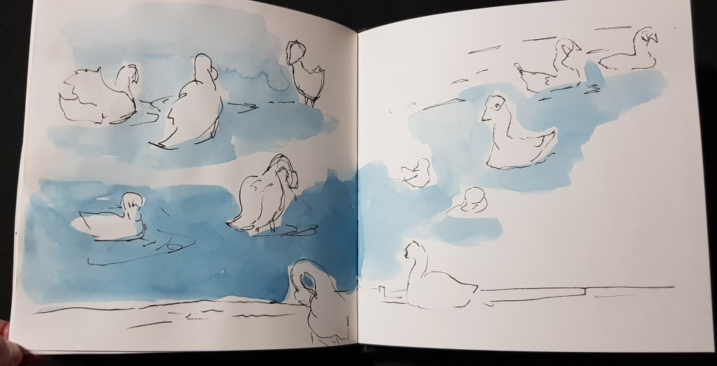
I really wanted to include people and crowds, but wasn’t sure how. An idea started taking shape from on of my sketches of the swan.
At this point while I like the idea of the swan being a metaphor for me wanting to feel “free” I was still thinking about people and crowds being more attention grabbing in the image.
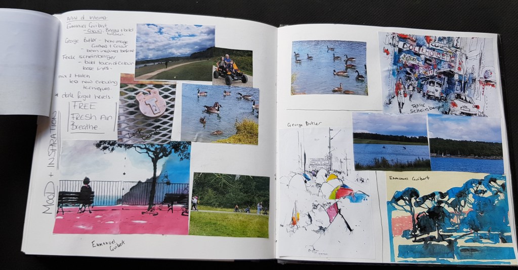
I started a mood board with a collection of my own images and the works of others I was drawn to.
Most important was the soft mood I felt.
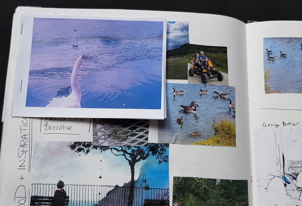
At this point my main attention was now on the swan, could I make this work? would it work in the style I wanted and did that mean I’ve have to drop people and crowds.
Visually I kept being drawn to this.
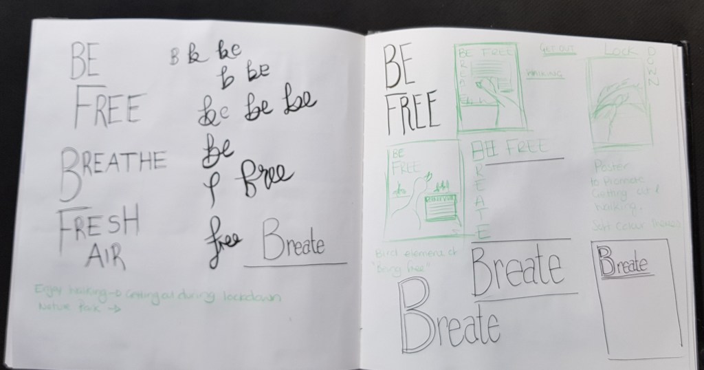
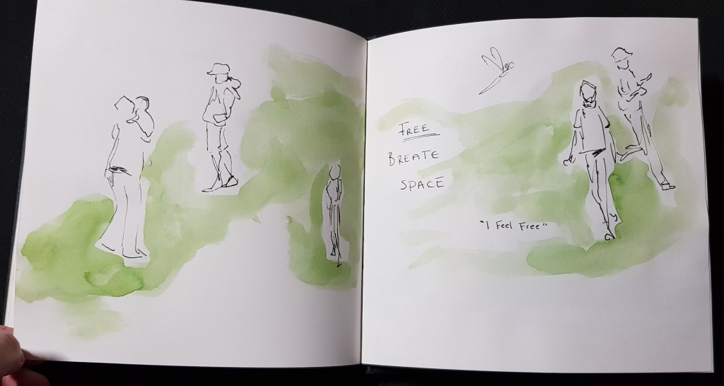
I started to feel that text would be important, to give a message something like “breathe”.
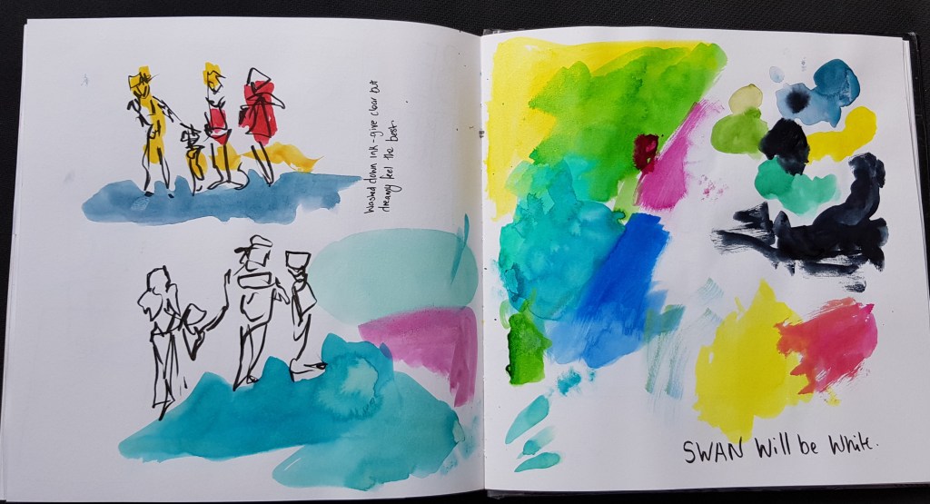
I started to drop some of my ideas, I was thinking limited splashes of bold colour. However the swan will be white, meaning this could be my negative space.
I didn’t want to overwhelming with colour as wanted a soft, gentle narrative.
(Above) testing colours with Ink, watercolour and liquid watercolour.
The washed down Bombay ink give the right feeling.
(Above) colour test, I run a risk of the colours being too light and washed out, as the darker test didn’t seem right, while the softer lighter does.
I know that posters are meant to be bold and eye catching.
That being said, I know I can always make brighter if the clients wanted that, so I will trust my instant in the softer washed ink.
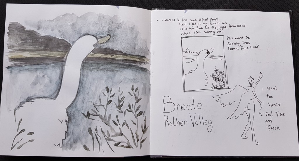
Before I did that, I got my scrawlr box supplies which included liquid pencils.
Used on this to see if was something worth exploring in this peace, it changed the mood completely so wouldn’t be right for this project.
(Above)
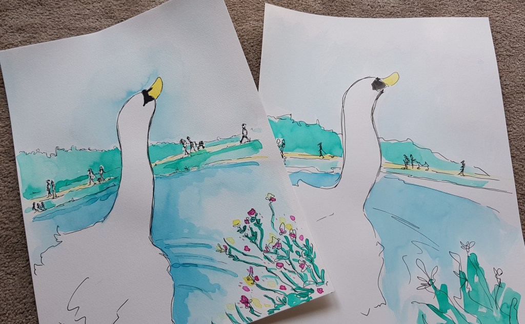
I wasn’t sure how I wanted to create this, using A3 cold pressed and hot pressed I created two versions.
Cold pressed paper being more detailed and a little “slower” in creating the lines.
Hot pressed being faster and looser.
Very quickly into this process I was leaning towards the cold pressed and the little more details, it had more of the message I wanted in the overall look.
I scanned and made adjustments in photoshop.
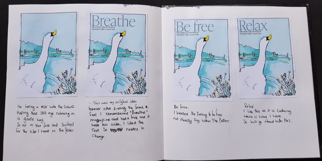
(above) printed A6 samples of each of my “text” wording.
I originally wanted breathe, but upon picking the font and placement I realised it felt like “Breathe” magazine, I check and it was too alike. So I was left with the option to change the text or the font and placement.
I knew due to the font style I wanted I would keep running into the same issue, so changing the text seems most sensible.
I settled on RELAX.

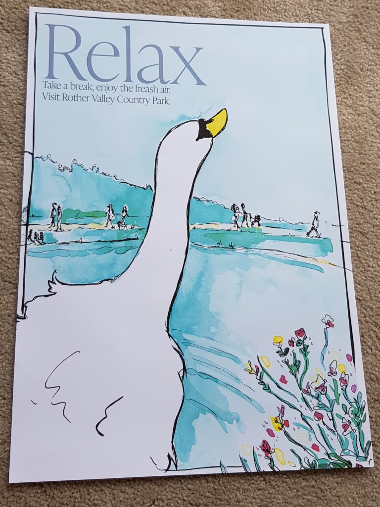
(Above) – I printed on A3 to test and I liked it even more.
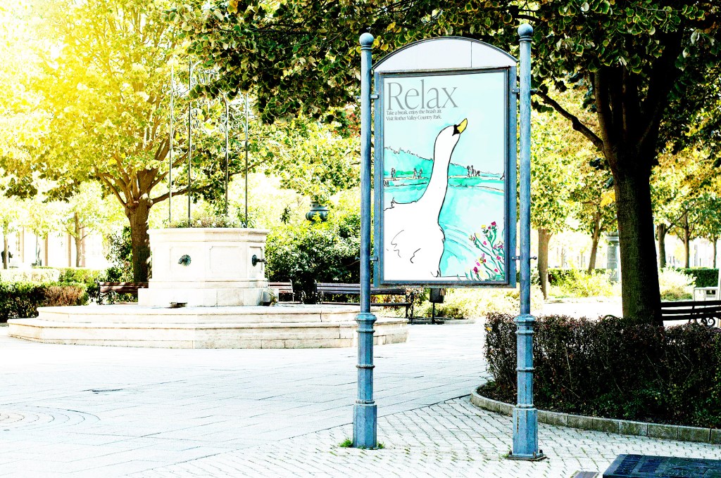
Tested using a free mock up, wanted to see what would look like in the setting. Little worried may not stand out enough for a poster, but I’m staying true to my feeling that the mood from the poster was the most important element in this case.
I like what I’ve created, just hope it serves it’s intended purpose and narrative that I wanted to express.
It’s also serves as proof weather and mood can completely change an illustration.
I found it hard at first to get started and it took its time to come together, but I enjoyed the process and made sure I kept in mind SCAMPER and all of exercise to date as I worked so I naturally made changes to the illustration.
I feel comfortable with the direction which I took as it felt natural to me.
Just have a few thoughts on my mind as I reflect on the finish piece.
Could I have risked it more bolder/eye catching ?
Should I have pushed more ?
Should it have been more about crowds and people?
Would it make people want to visit during lockdown?
Credits, resources and references
Mock up – http://mockupplanet.com/free-artistic-outdoor-poster-billboard-mockup/
http://www.rothervalleycountrypark.co.uk/

One thought on “Assignment three: Illustrative people and places”